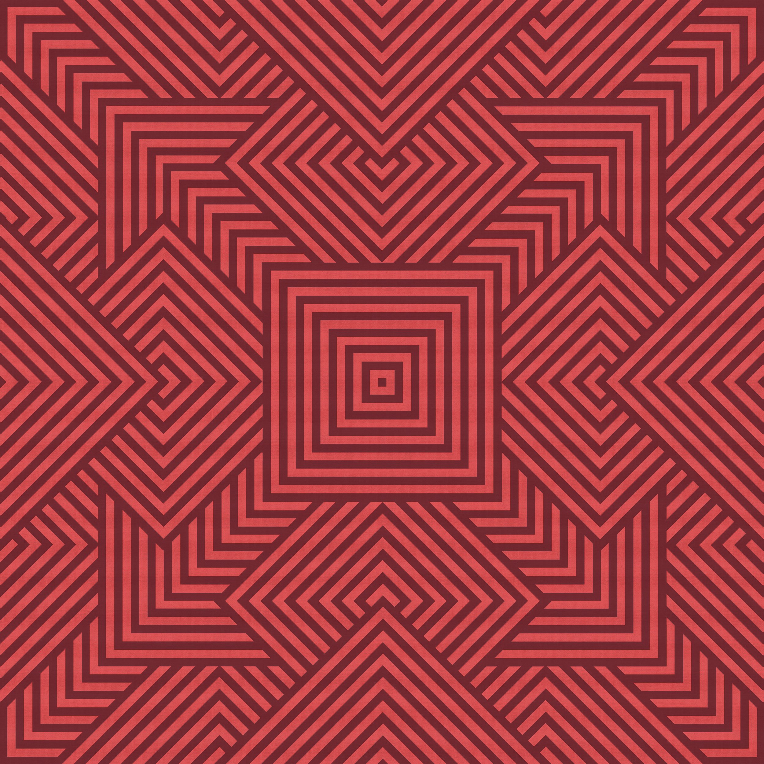
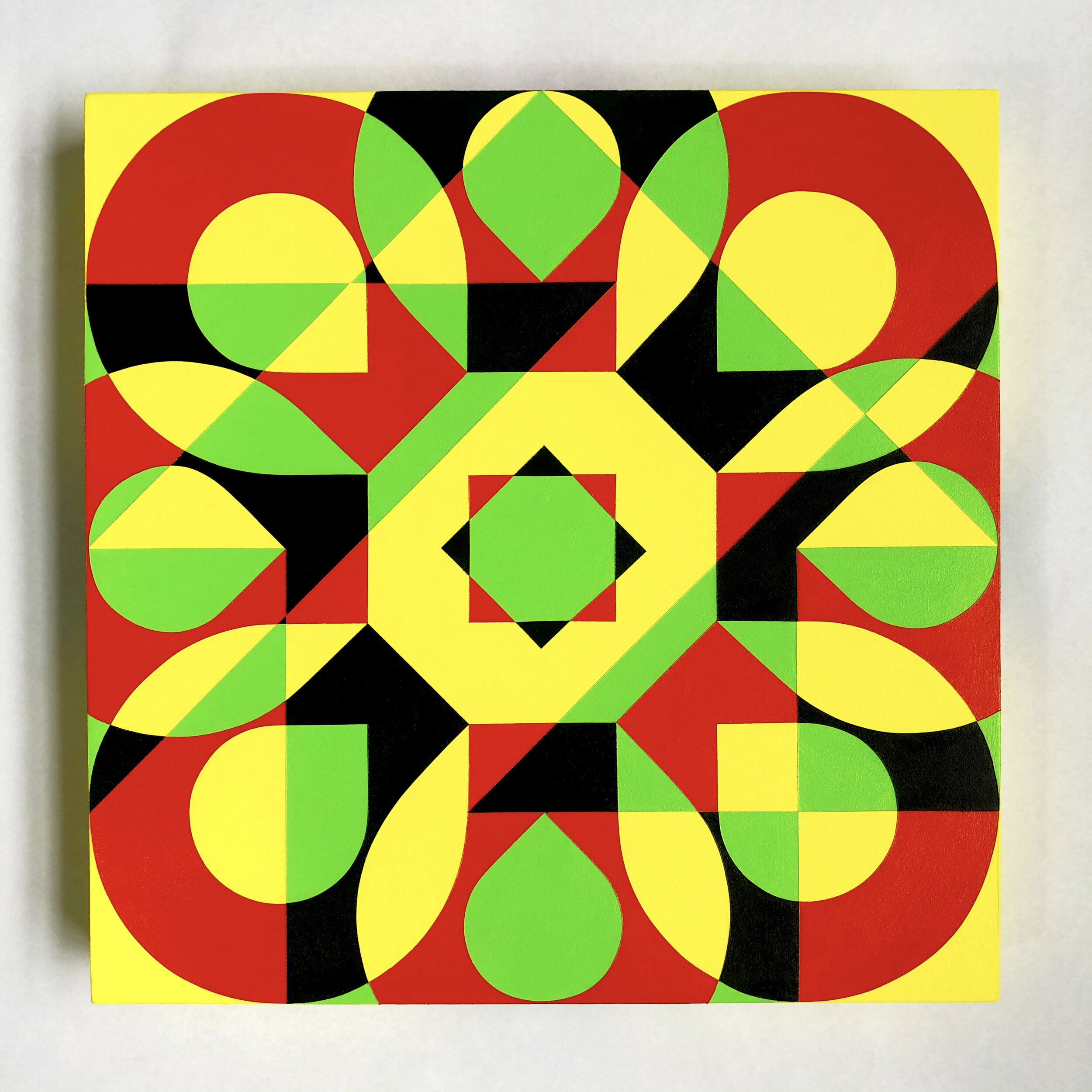
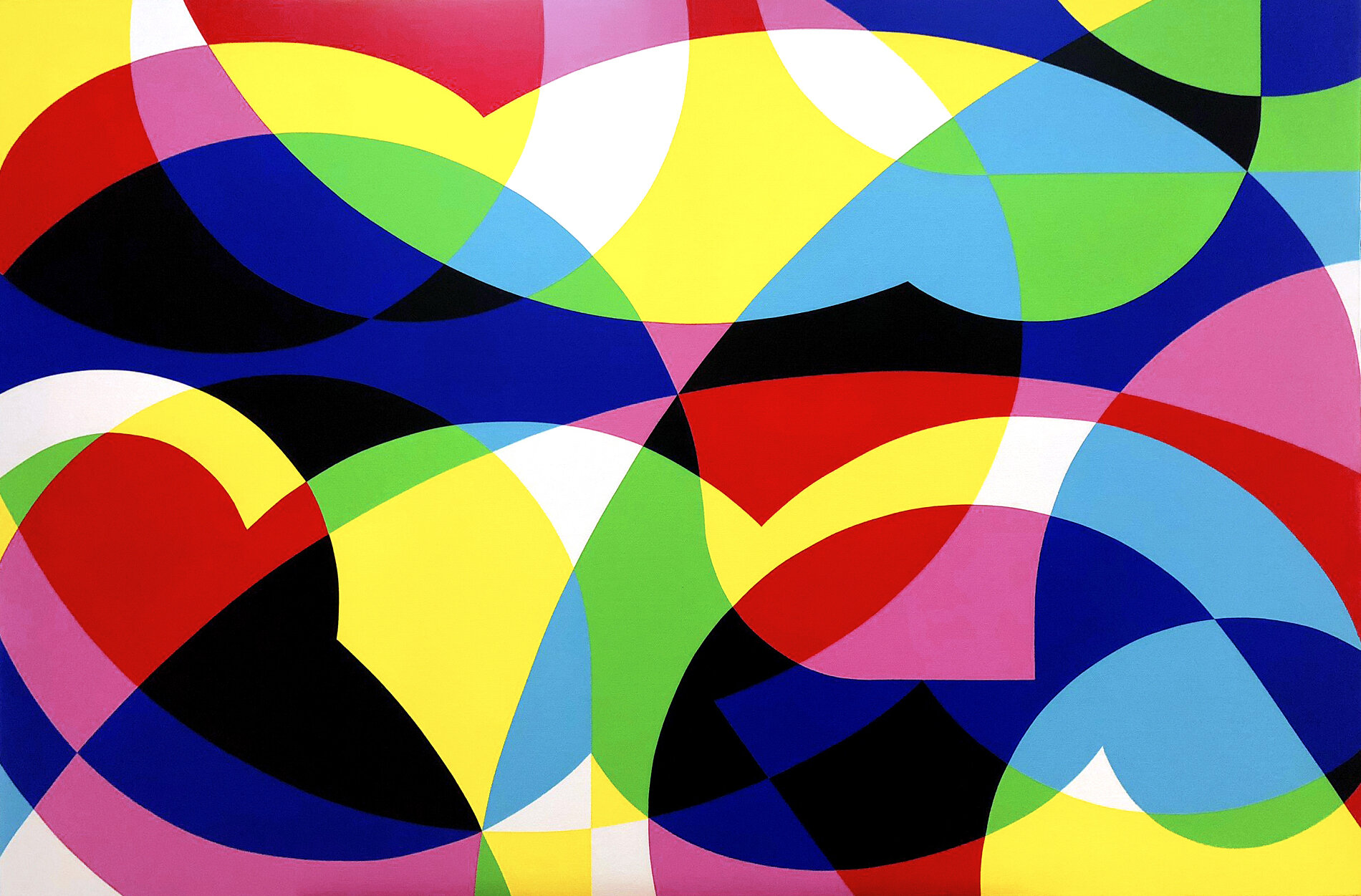
This painting is the last in a series I call The Sum Of Its Parts. This series explores the concepts of overwhelm and awe, and aims to invoke these feelings through strong geometric designs, and either clashing or complimentary colour choices.
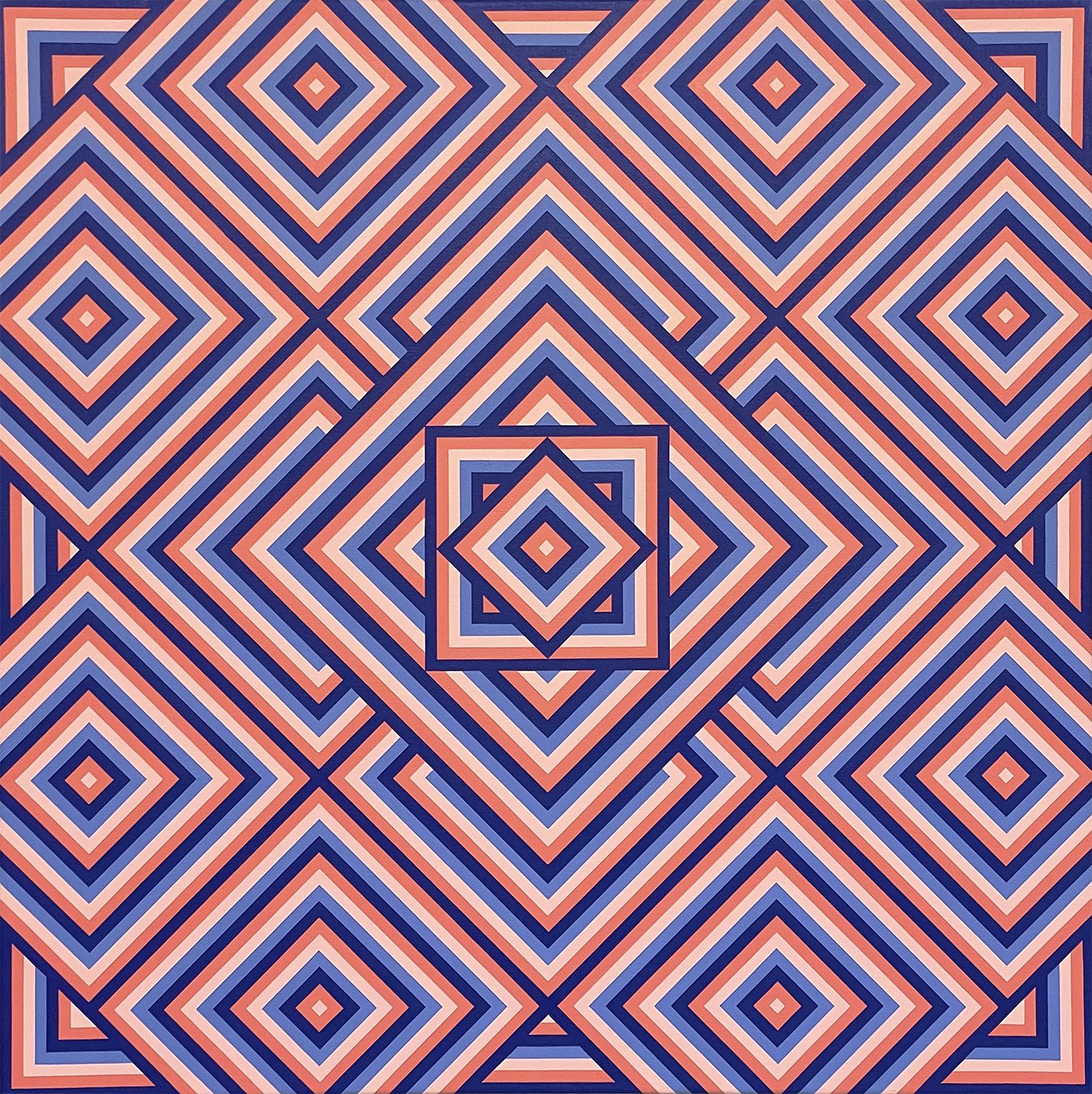
This painting is fifth in a series I call The Sum Of Its Parts. This series explores the concepts of overwhelm and awe, and aims to invoke these feelings through strong geometric designs, and either clashing or complimentary colour choices.
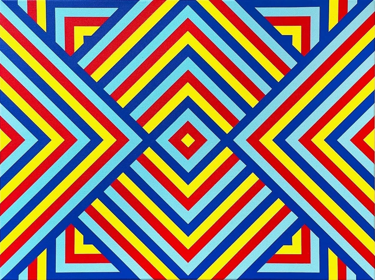
This painting is fourth in a series I call The Sum Of Its Parts. This series explores the concepts of overwhelm and awe, and aims to invoke these feelings through strong geometric designs, and either clashing or complimentary colour choices.
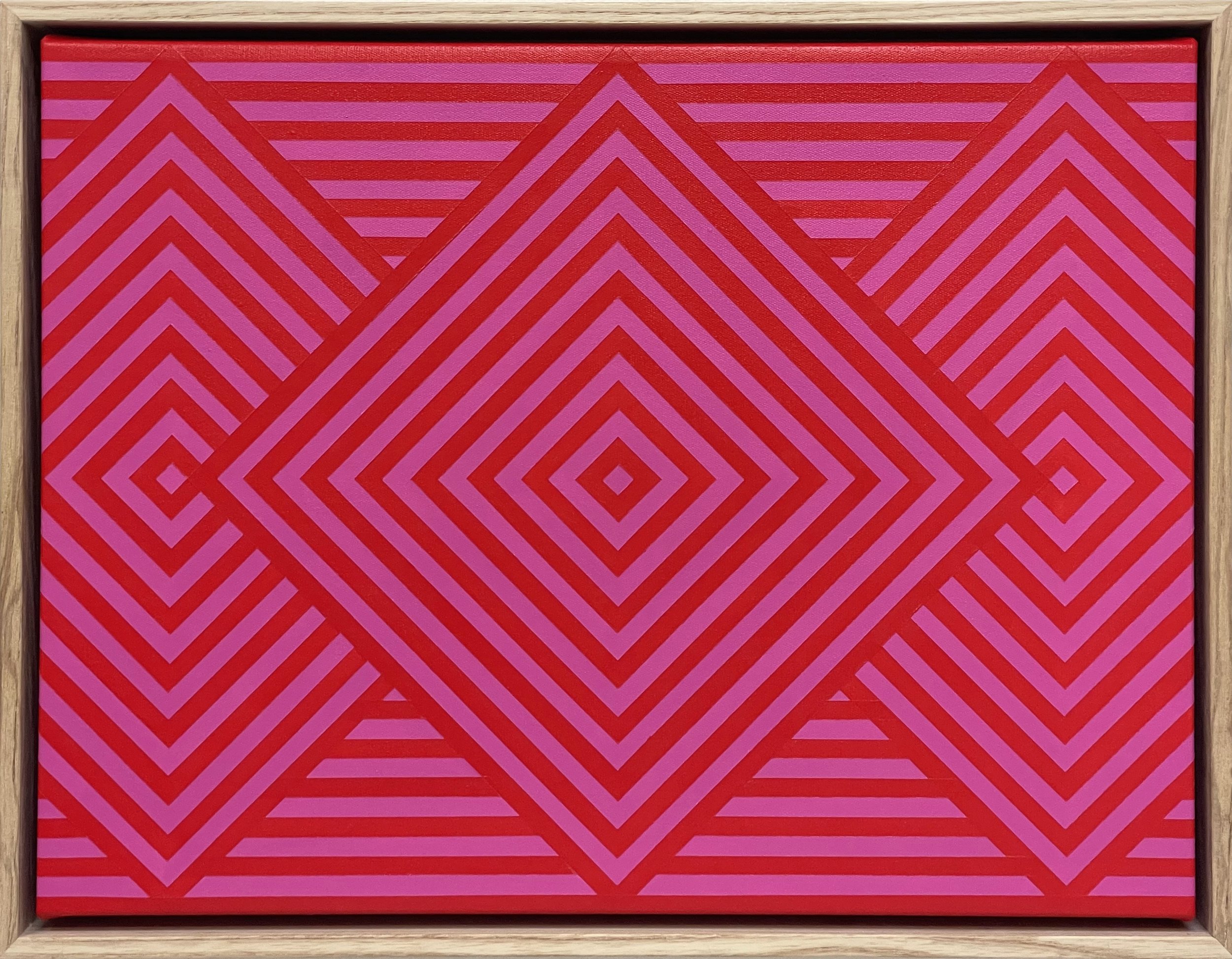
This painting is third in a series I call The Sum Of Its Parts. This series explores the concepts of overwhelm and awe, and aims to invoke these feelings through strong geometric designs, and either clashing or complimentary colour choices.
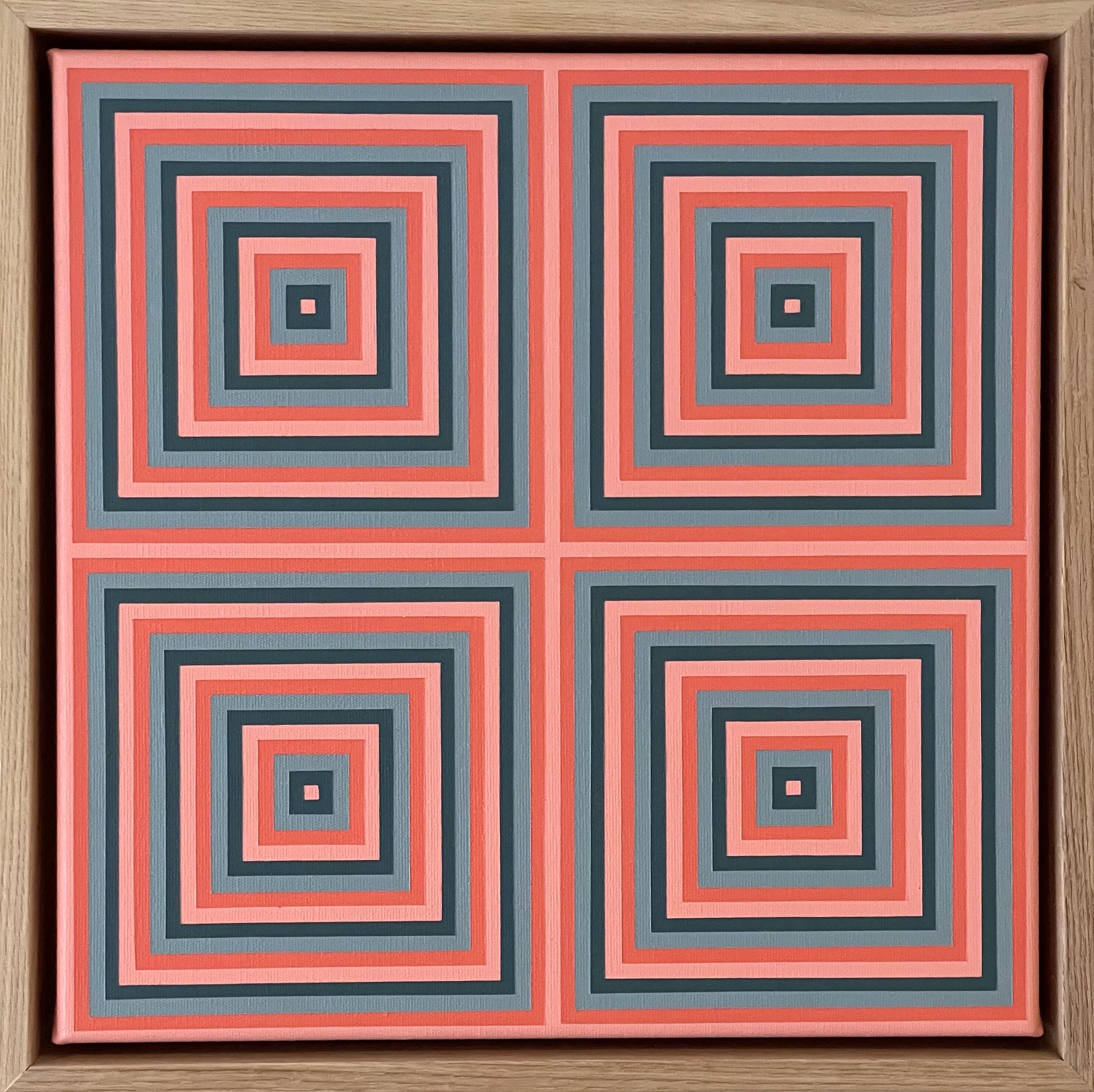
This painting is second in a series I call The Sum Of Its Parts. This series explores the concepts of overwhelm and awe, and aims to invoke these feelings through strong geometric designs, and either clashing or complimentary colour choices.
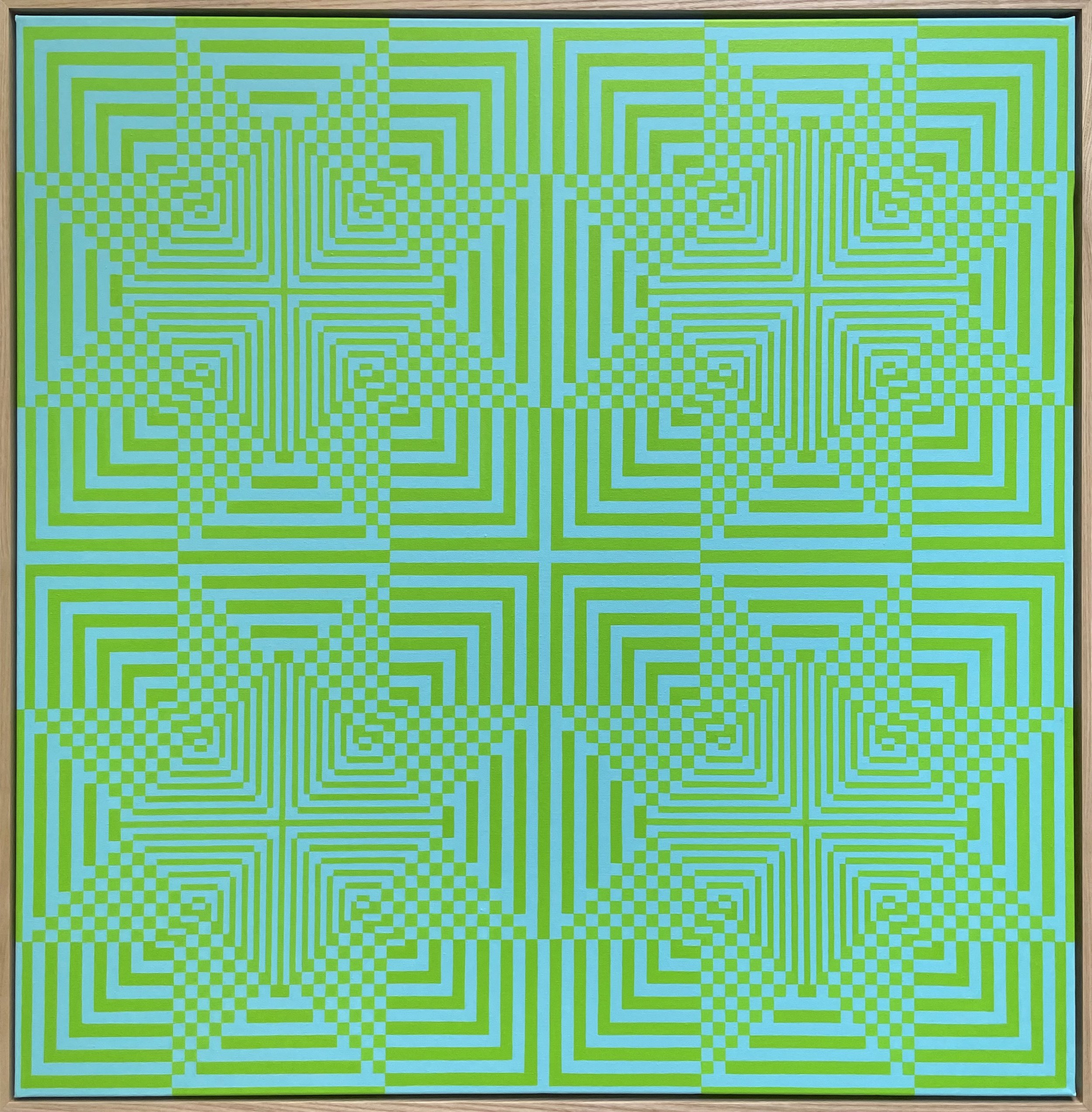
This painting is the first in a series I call The Sum Of Its Parts. This series explores the concepts of overwhelm and awe, and aims to invoke these feelings through strong geometric designs, and either clashing or complimentary colour choices. This painting is also the largest of all my works to date, and as I’m a glutton for punishment, was completed freehand.
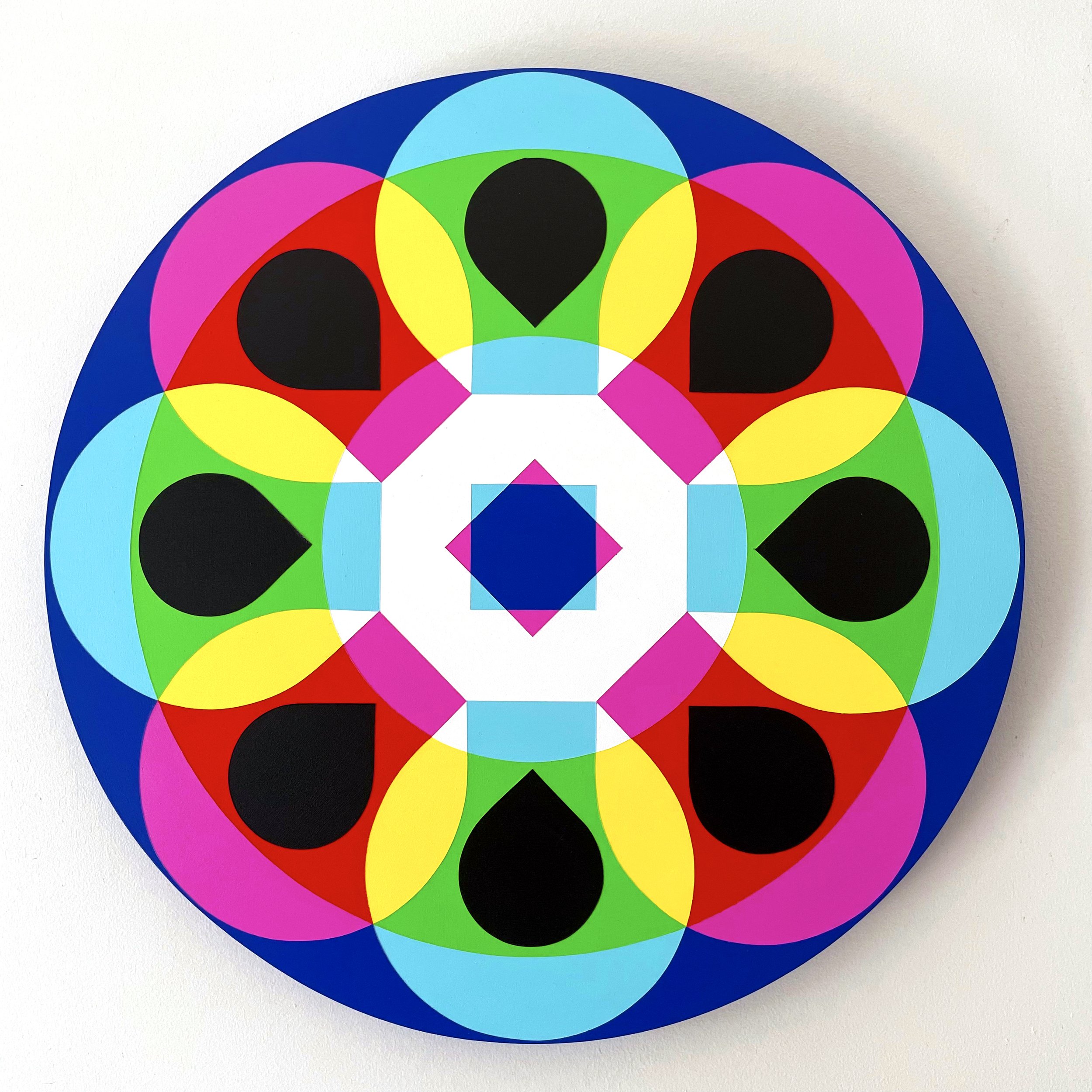
‘Open’ has been one of those buzz words of the last 6 months, so I thought it was appropriate to start the year off with painting that celebrates the long awaited opening of Australia’s border later this month. It references the Apple keyboard shortcut Command+O for ‘Open’.
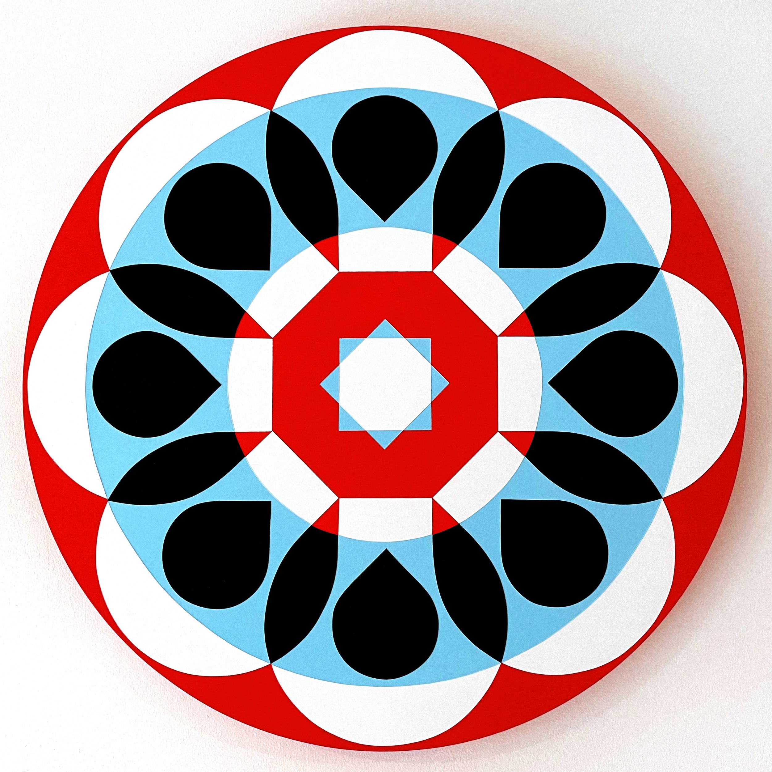
‘Open’ has been one of those buzz words of the last 6 months, so I thought it was appropriate to start the year off with painting that celebrates the long awaited opening of Australia’s border later this month. It references the Apple keyboard shortcut Command+O for ‘Open’.
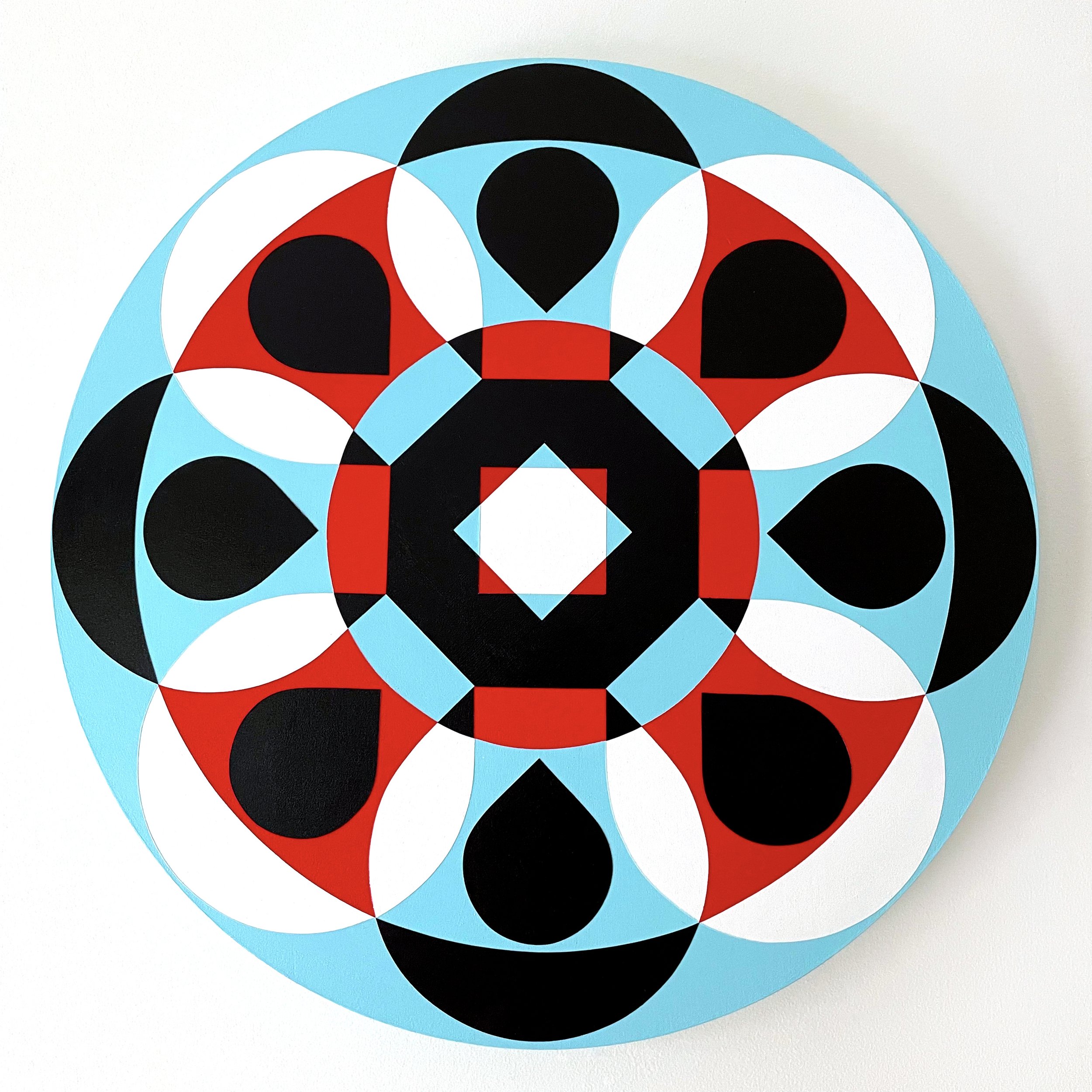
‘Open’ has been one of those buzz words of the last 6 months, so I thought it was appropriate to start the year off with painting that celebrates the long awaited opening of Australia’s border later this month. It references the Apple keyboard shortcut Command+O for ‘Open’.
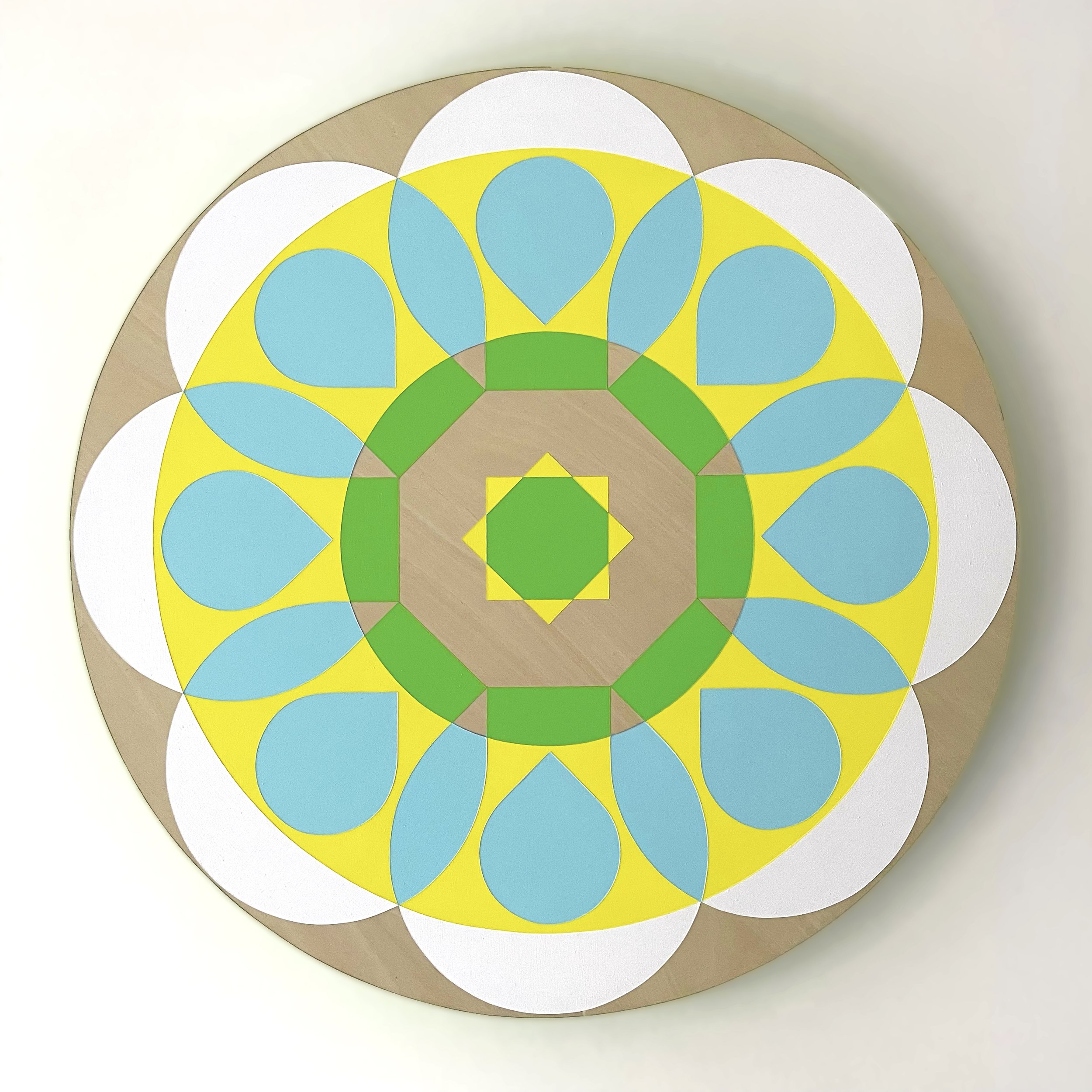
‘Open’ has been one of those buzz words of the last 6 months, so I thought it was appropriate to start the year off with painting that celebrates the long awaited opening of Australia’s border later this month. It references the Apple keyboard shortcut Command+O for ‘Open’
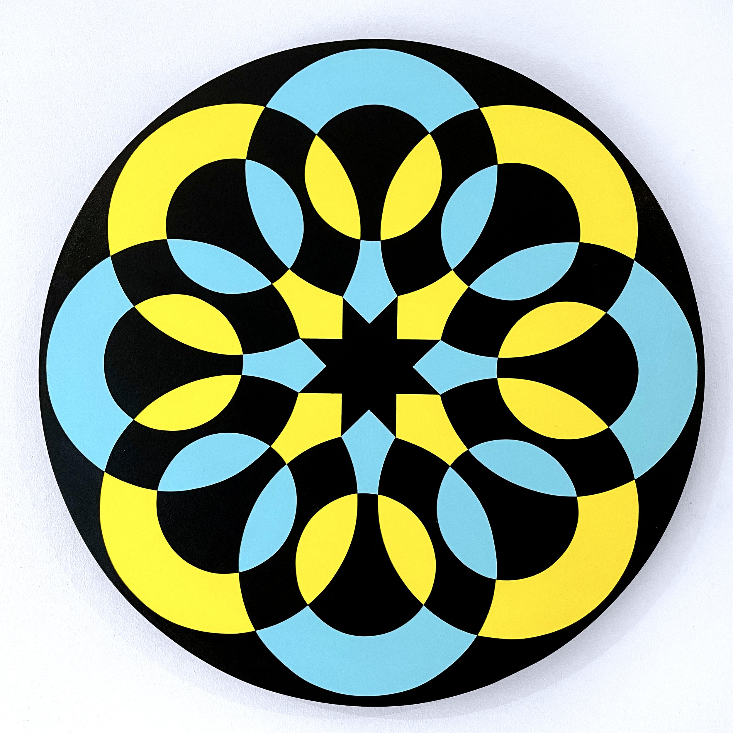
To celebrate International Women’s Day 2022, and all the amazing women in my life and beyond, I painted ‘Sisterhood 02’ based on the symbol for ‘woman’.
“A clutch of women is the most tender, most tough place on Earth” — Where The Crawdads Sing, by Delia Owens
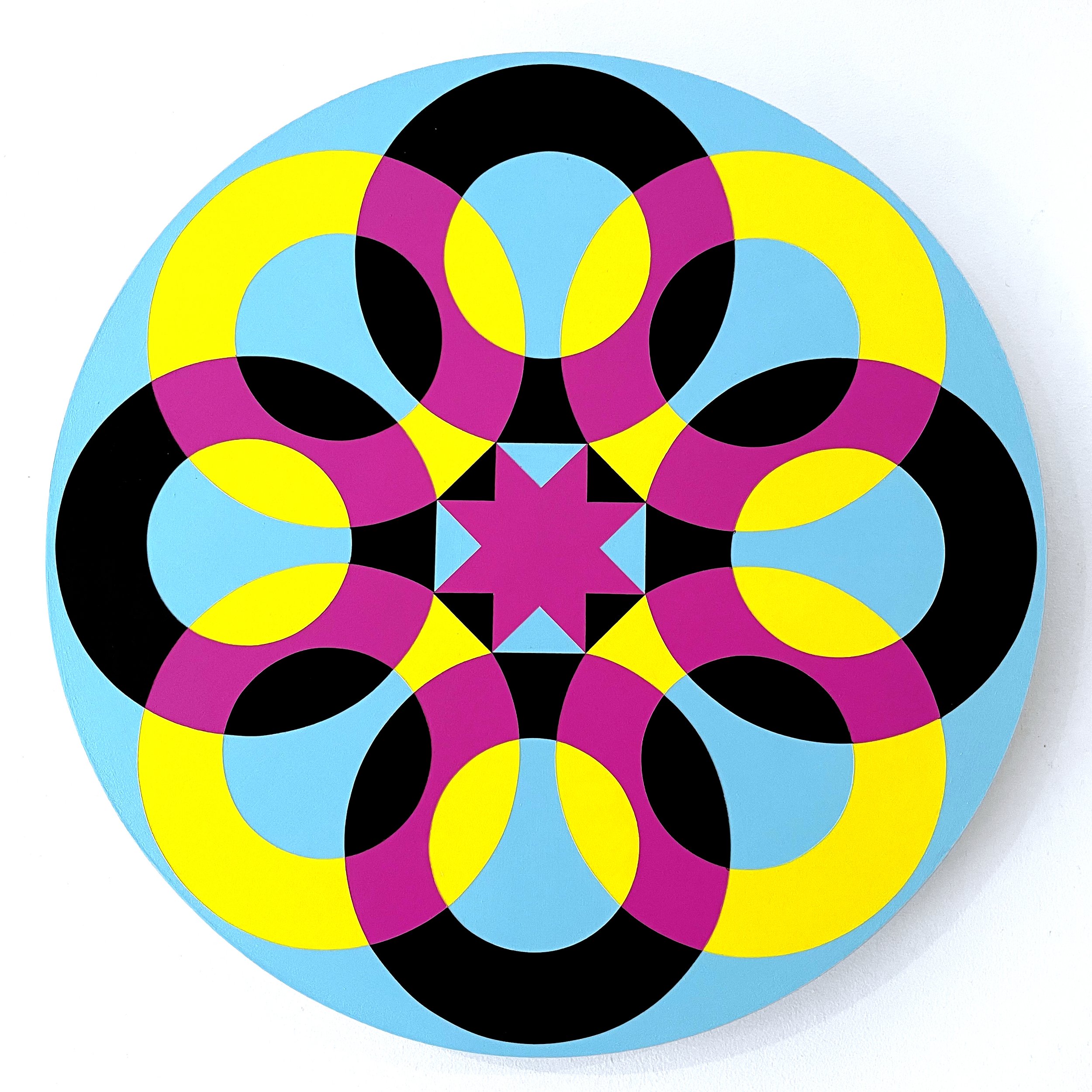
To celebrate International Women’s Day 2022, and all the amazing women in my life and beyond, I painted ‘Sisterhood 01’ based on the symbol for ‘woman’.
“A clutch of women is the most tender, most tough place on Earth” — Where The Crawdads Sing, by Delia Owens
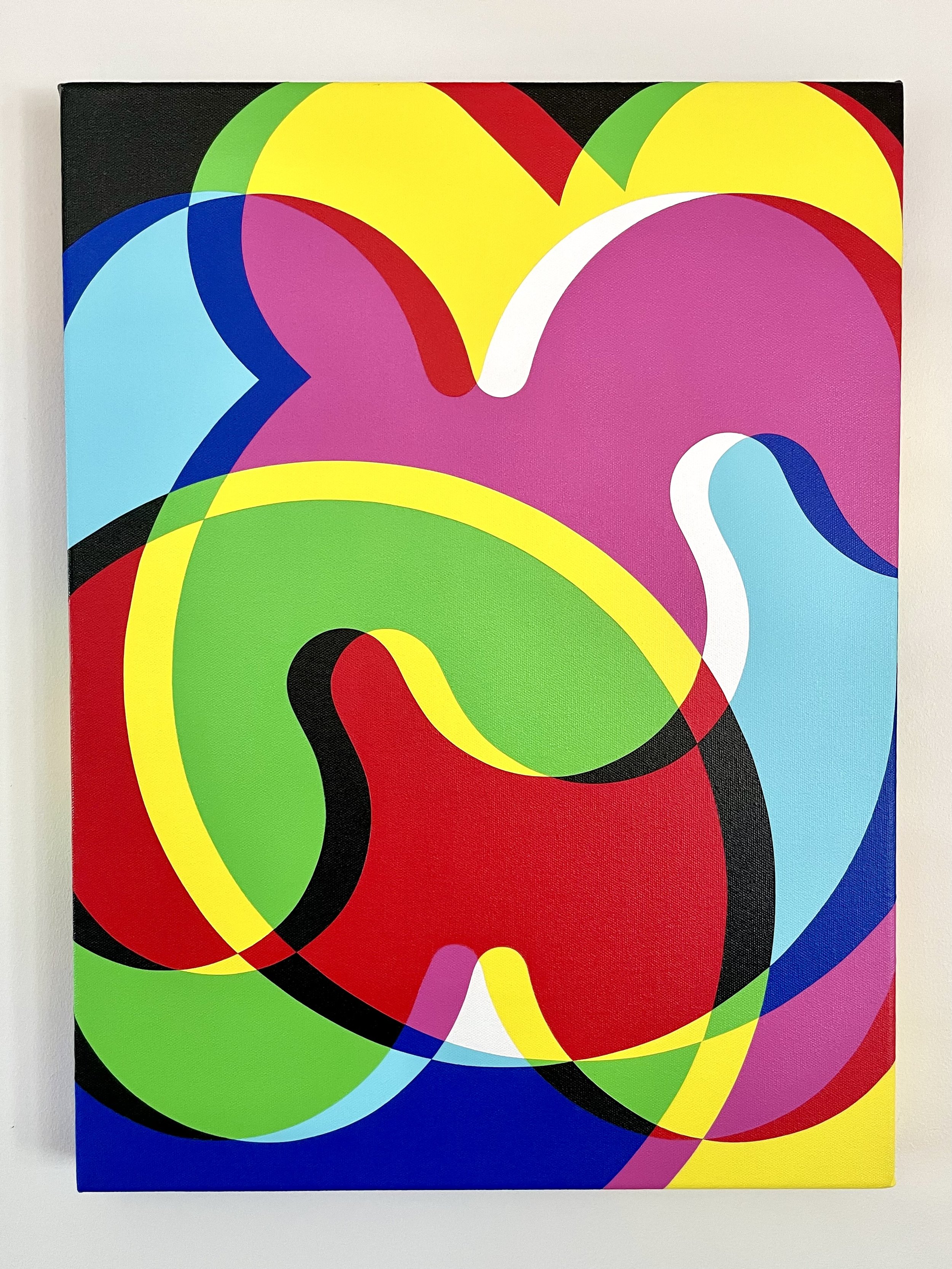
This was a commission for a family in Stockholm, Sweden. The lettering spells the initials of each family member.
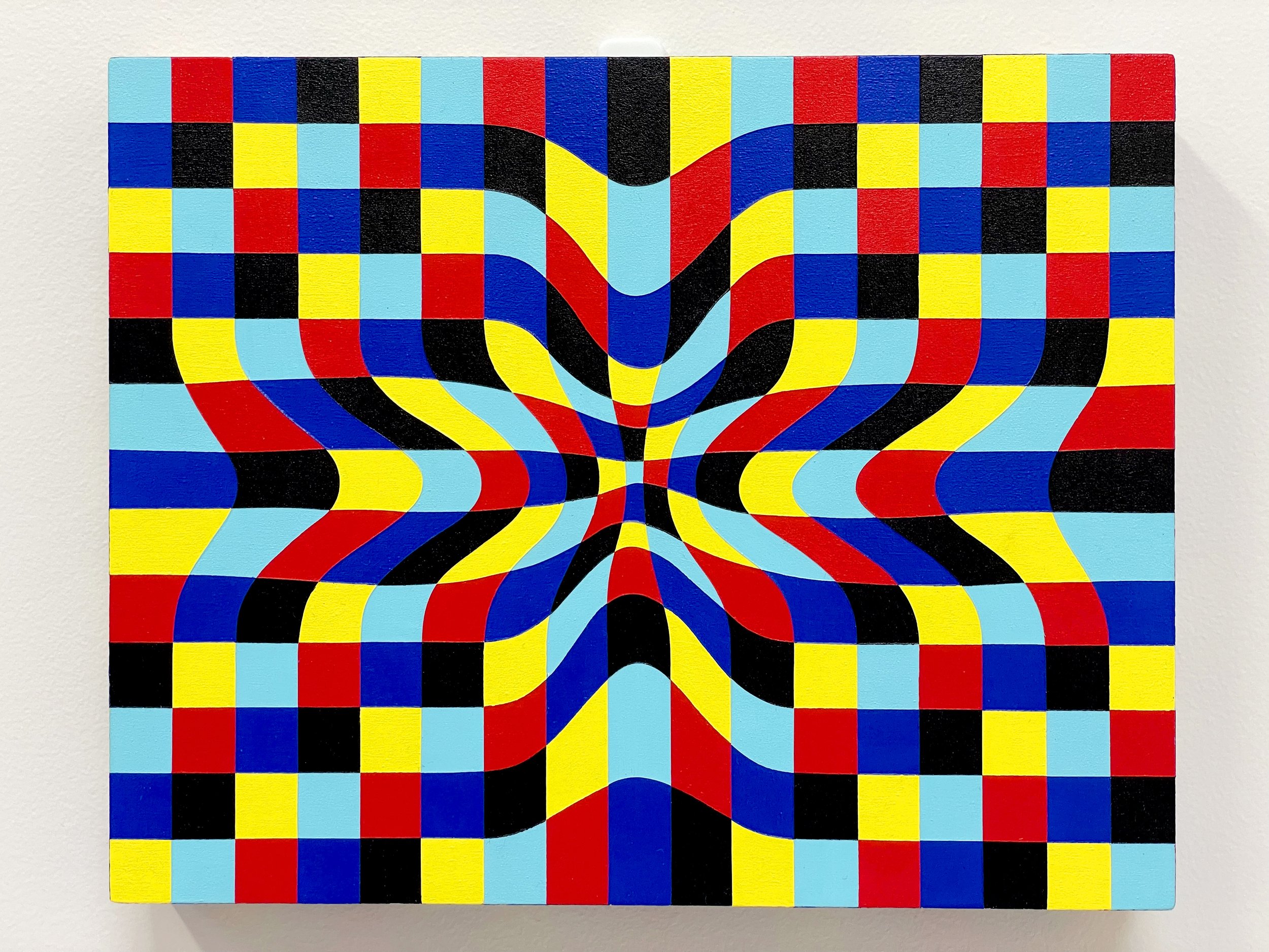
My Mum often says that ‘time is elastic’, and this has never felt more apt than the last 18 months. During the dark days of lockdown, time puckered in to pass at an agonising glacial pace. When we were free, time puffed out like a helium balloon and floated to the ceiling before we could catch the string.
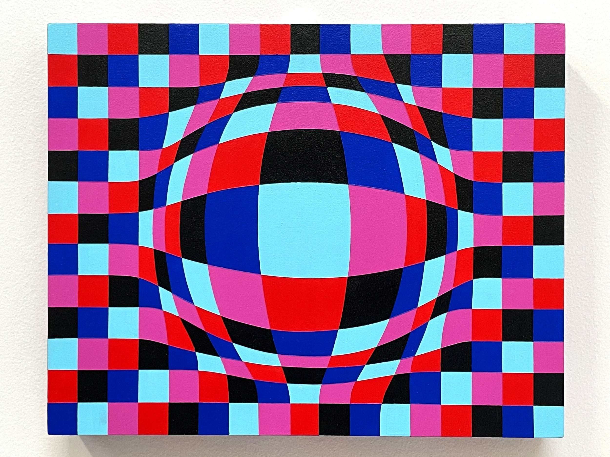
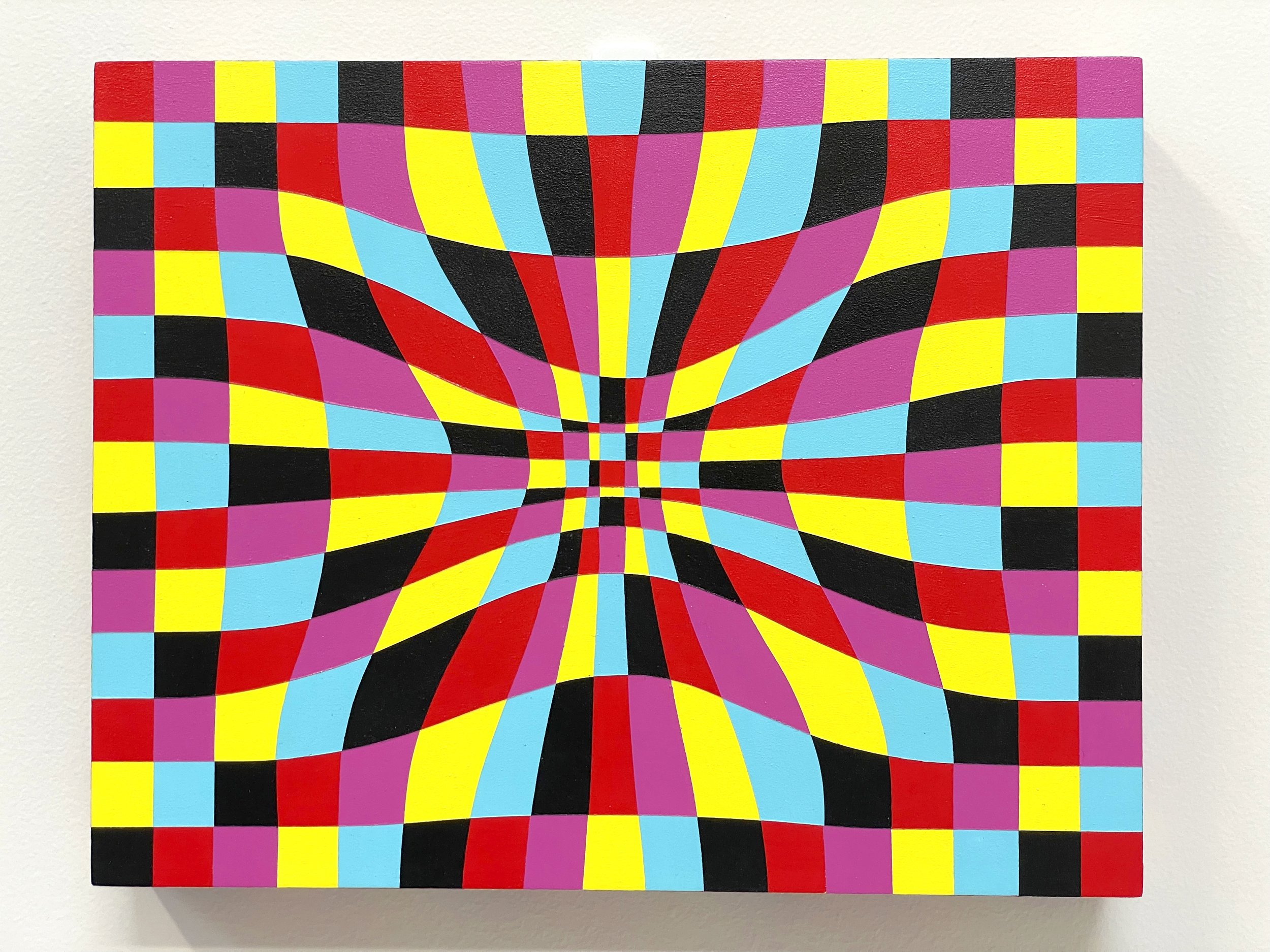
These three little paintings explore the idea of time being stretchy, and they took a crazy amount of time — approximately 40 hours each! But when I started them it turned out that time went all helium on me, and I was so involved in them that it sped up this bloody long lockdown exponentially! Time is precious, Time is exact, Time is relative, Time is the fourth dimension, Time is elastic. Thanks Time for being so HARDCORE! 👊
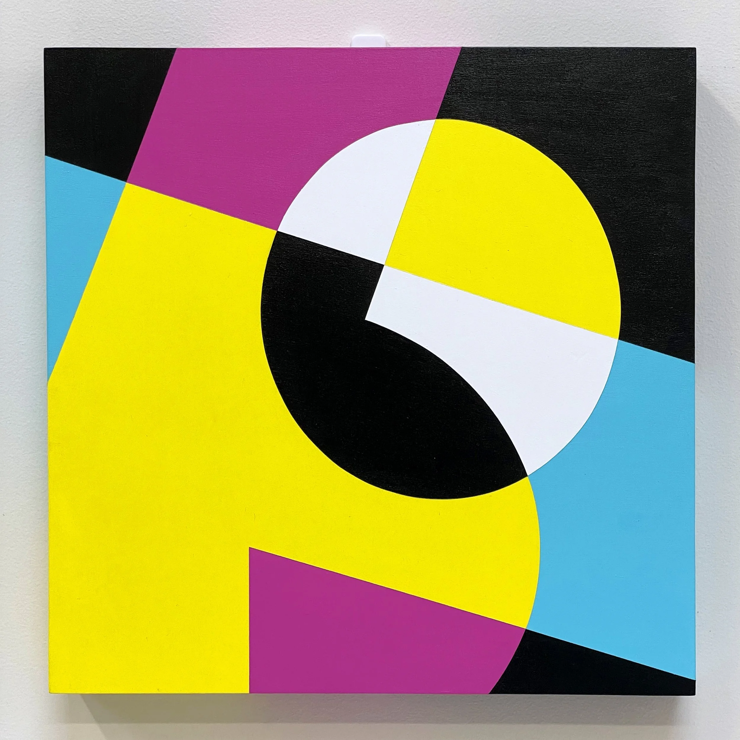
These paintings are a continuation of a series of artworks I’ve been working on since the start of the pandemic. They are designed using ‘bubble’ letters that I created, and spell out ‘7.6’ which is the current number [of millions] of Australians that were born overseas, many of whom have been separated from their home countries and families for almost two years due to Australia’s border closure policies.
This first panel says ‘7.6’ once, the second panel says it twice, and the third panel says it eight times. This symbolises the ideas of both repetition (Groundhog Day) and rapid manifestation, concepts which have been very prevalent in our society since the start of the pandemic. I have painted each triptych three times in different colour ways to emphasise these concepts.
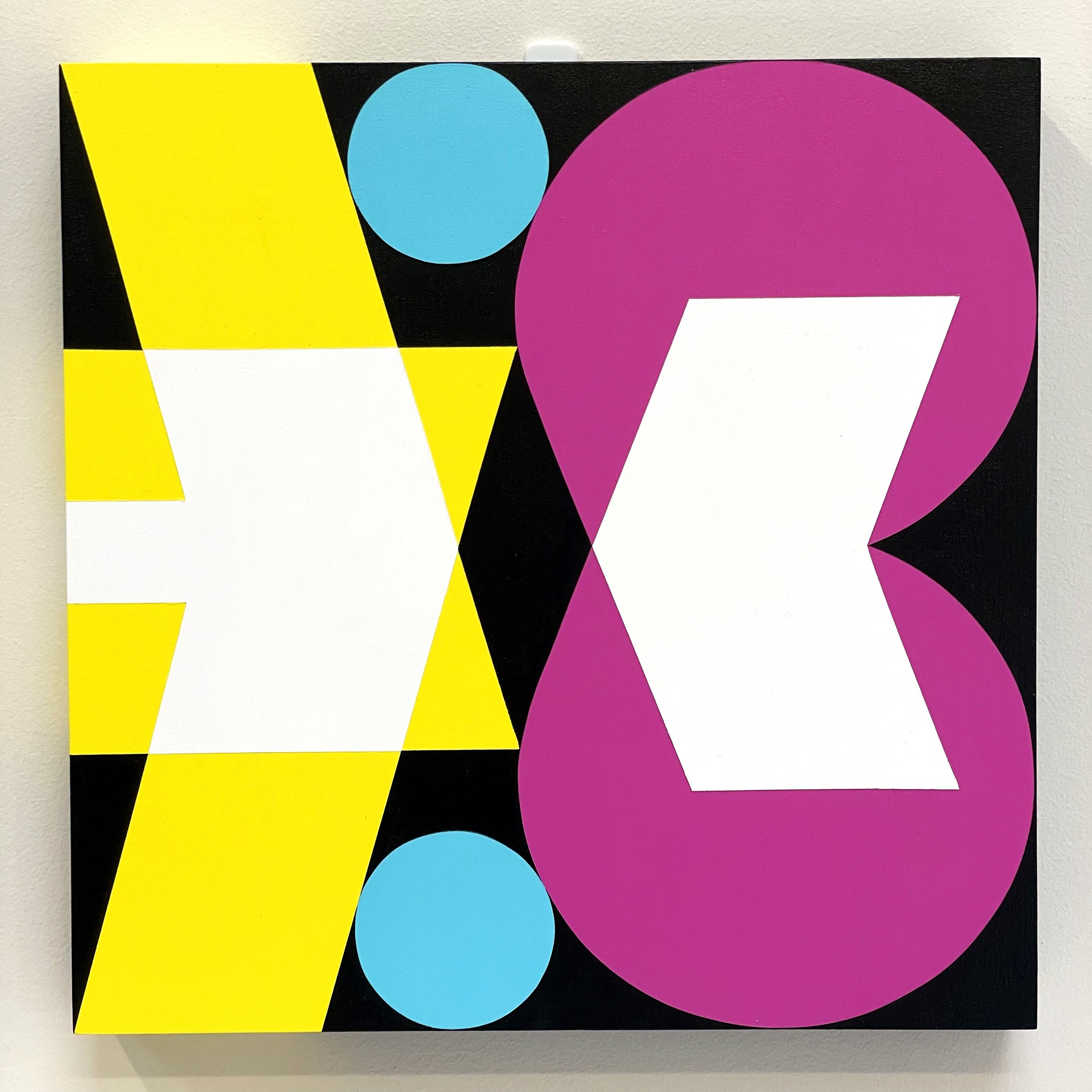
These paintings are a continuation of a series of artworks I’ve been working on since the start of the pandemic. They are designed using ‘bubble’ letters that I created, and spell out ‘7.6’ which is the current number [of millions] of Australians that were born overseas, many of whom have been separated from their home countries and families for almost two years due to Australia’s border closure policies.
The first panel says ‘7.6’ once, this second panel says it twice, and the third panel says it eight times. This symbolises the ideas of both repetition (Groundhog Day) and rapid manifestation, concepts which have been very prevalent in our society since the start of the pandemic. I have painted each triptych three times in different colour ways to emphasise these concepts.
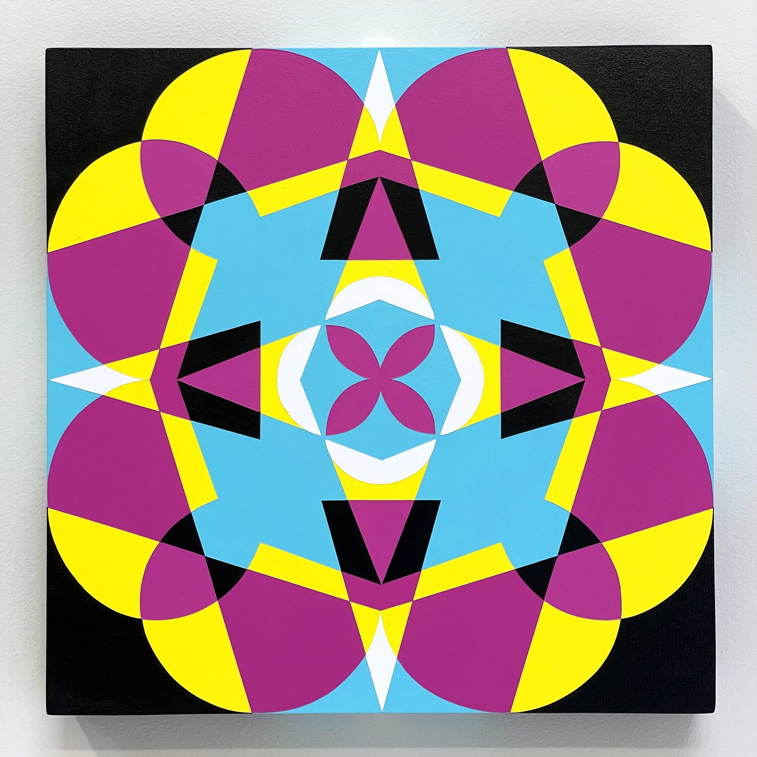
These paintings are a continuation of a series of artworks I’ve been working on since the start of the pandemic. They are designed using ‘bubble’ letters that I created, and spell out ‘7.6’ which is the current number [of millions] of Australians that were born overseas, many of whom have been separated from their home countries and families for almost two years due to Australia’s border closure policies.
The first panel says ‘7.6’ once, the second panel says it twice, and this third panel says it eight times. This symbolises the ideas of both repetition (Groundhog Day) and rapid manifestation, concepts which have been very prevalent in our society since the start of the pandemic. I have painted each triptych three times in different colour ways to emphasise these concepts.
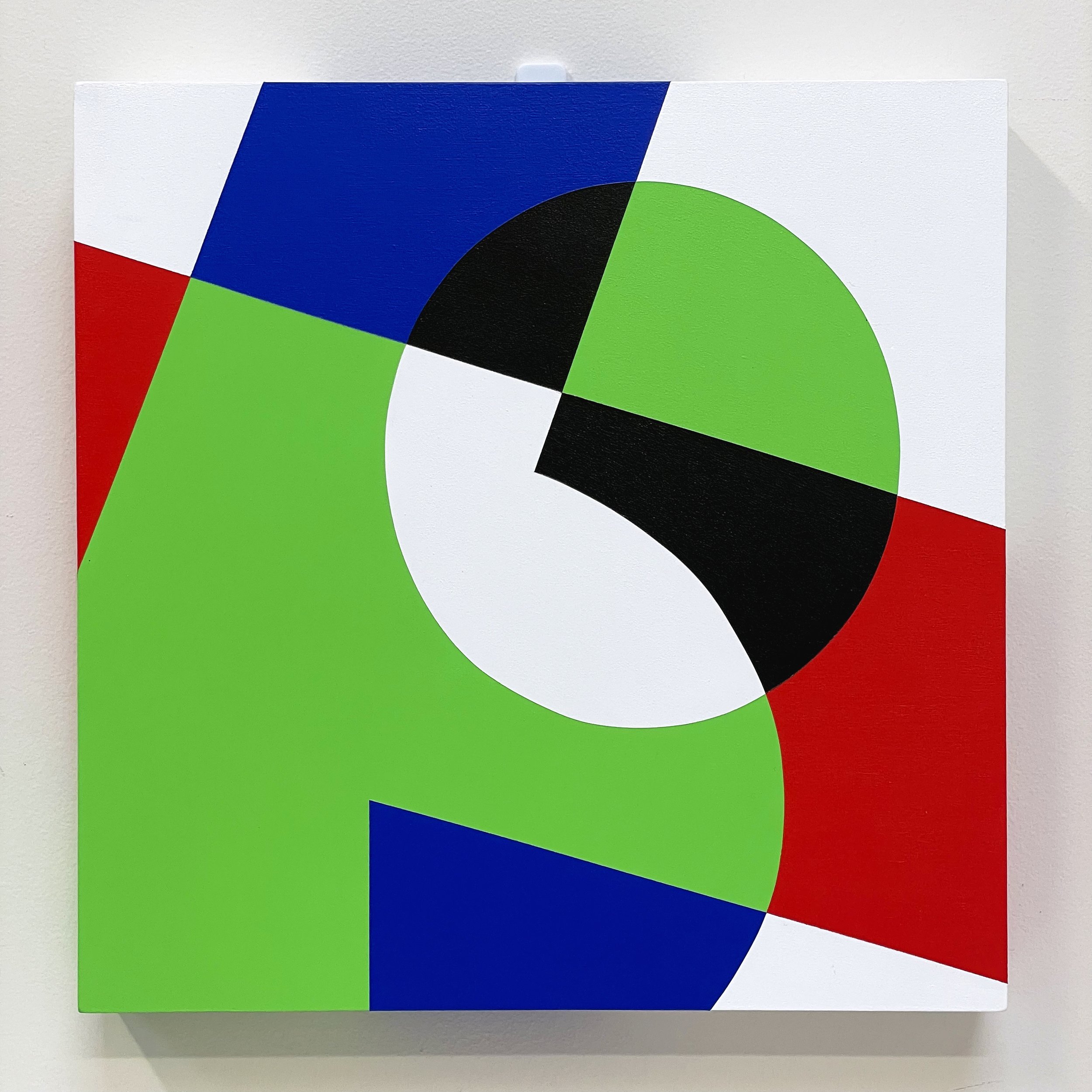
These paintings are a continuation of a series of artworks I’ve been working on since the start of the pandemic. They are designed using ‘bubble’ letters that I created, and spell out ‘7.6’ which is the current number [of millions] of Australians that were born overseas, many of whom have been separated from their home countries and families for almost two years due to Australia’s border closure policies.
This first panel says ‘7.6’ once, the second panel says it twice, and the third panel says it eight times. This symbolises the ideas of both repetition (Groundhog Day) and rapid manifestation, concepts which have been very prevalent in our society since the start of the pandemic. I have painted each triptych three times in different colour ways to emphasise these concepts.
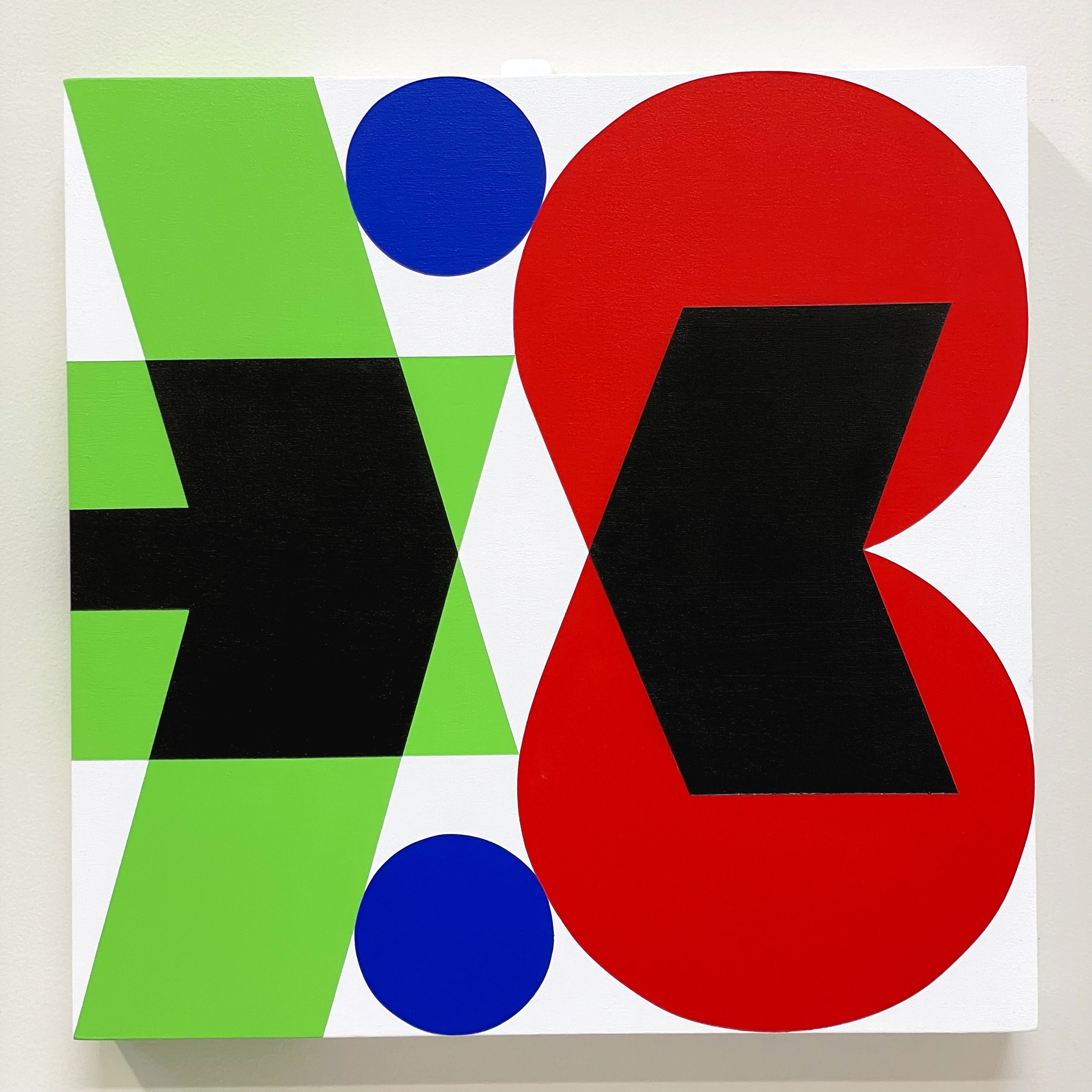
These paintings are a continuation of a series of artworks I’ve been working on since the start of the pandemic. They are designed using ‘bubble’ letters that I created, and spell out ‘7.6’ which is the current number [of millions] of Australians that were born overseas, many of whom have been separated from their home countries and families for almost two years due to Australia’s border closure policies.
The first panel says ‘7.6’ once, this second panel says it twice, and the third panel says it eight times. This symbolises the ideas of both repetition (Groundhog Day) and rapid manifestation, concepts which have been very prevalent in our society since the start of the pandemic. I have painted each triptych three times in different colour ways to emphasise these concepts.
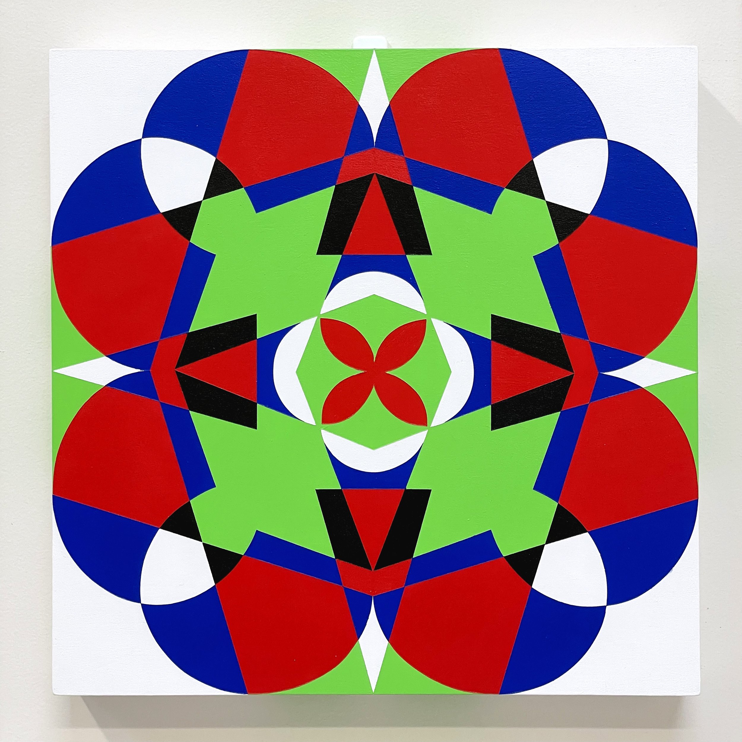
These paintings are a continuation of a series of artworks I’ve been working on since the start of the pandemic. They are designed using ‘bubble’ letters that I created, and spell out ‘7.6’ which is the current number [of millions] of Australians that were born overseas, many of whom have been separated from their home countries and families for almost two years due to Australia’s border closure policies.
The first panel says ‘7.6’ once, the second panel says it twice, and this third panel says it eight times. This symbolises the ideas of both repetition (Groundhog Day) and rapid manifestation, concepts which have been very prevalent in our society since the start of the pandemic. I have painted each triptych three times in different colour ways to emphasise these concepts.
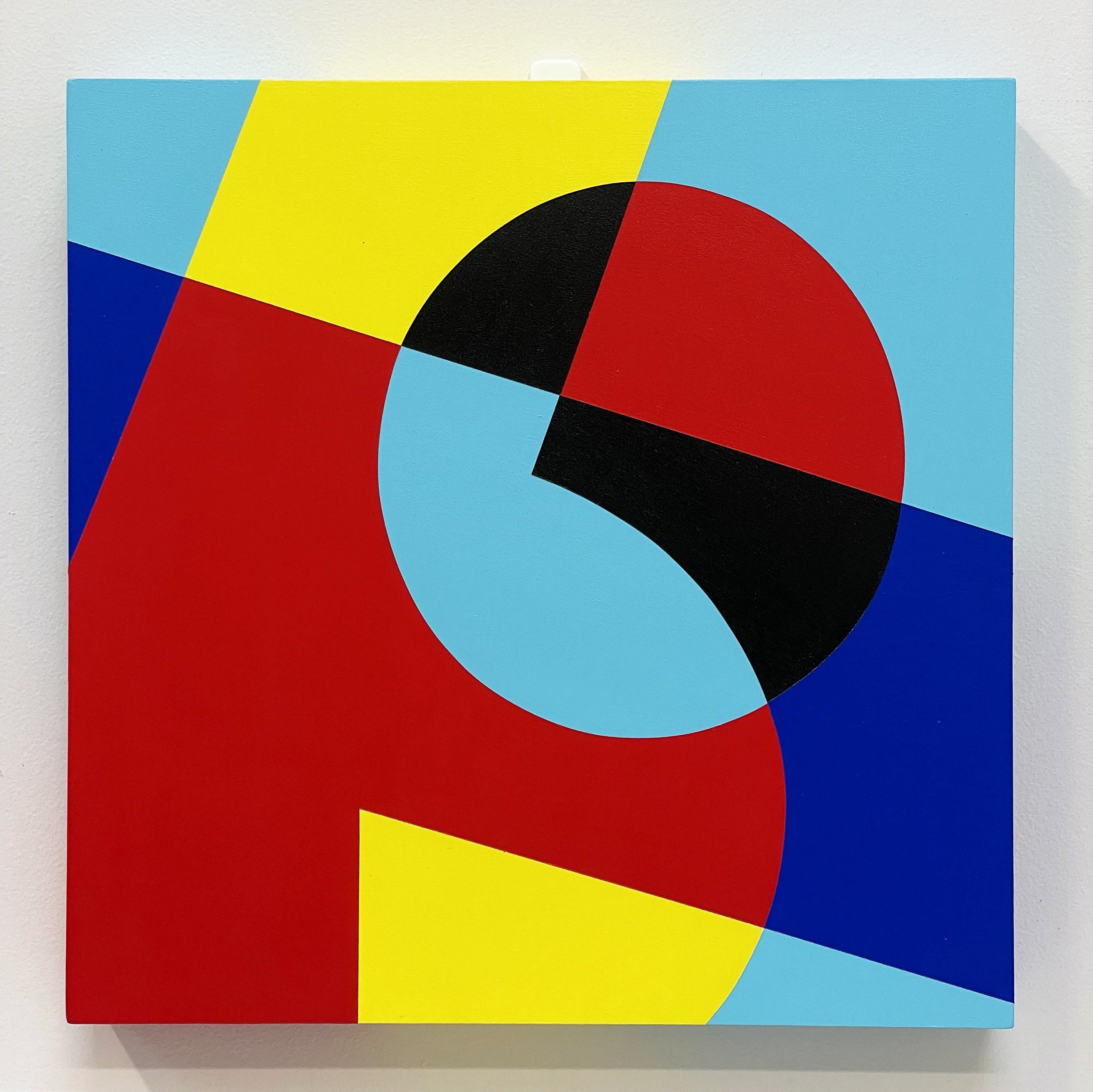
These paintings are a continuation of a series of artworks I’ve been working on since the start of the pandemic. They are designed using ‘bubble’ letters that I created, and spell out ‘7.6’ which is the current number [of millions] of Australians that were born overseas, many of whom have been separated from their home countries and families for almost two years due to Australia’s border closure policies.
This first panel says ‘7.6’ once, the second panel says it twice, and the third panel says it eight times. This symbolises the ideas of both repetition (Groundhog Day) and rapid manifestation, concepts which have been very prevalent in our society since the start of the pandemic. I have painted each triptych three times in different colour ways to emphasise these concepts.
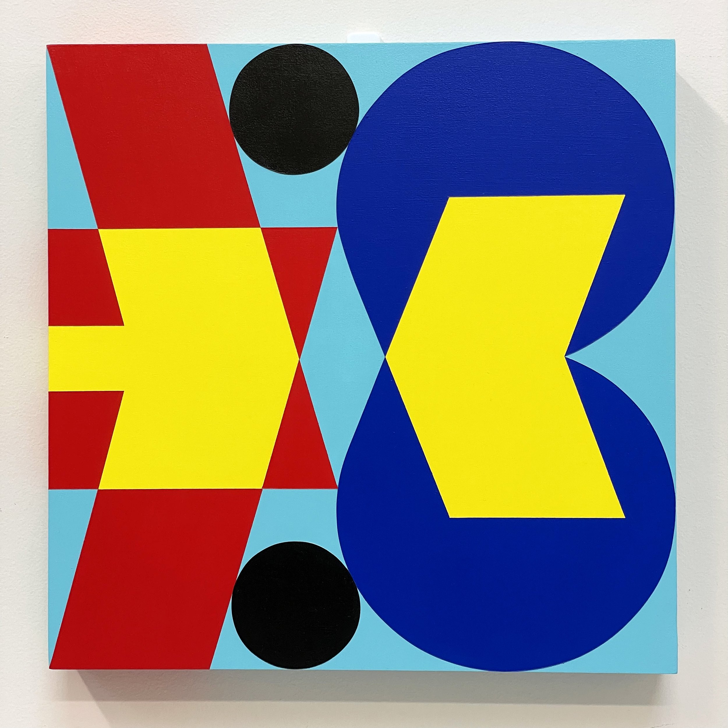
These paintings are a continuation of a series of artworks I’ve been working on since the start of the pandemic. They are designed using ‘bubble’ letters that I created, and spell out ‘7.6’ which is the current number [of millions] of Australians that were born overseas, many of whom have been separated from their home countries and families for almost two years due to Australia’s border closure policies.
The first panel says ‘7.6’ once, this second panel says it twice, and the third panel says it eight times. This symbolises the ideas of both repetition (Groundhog Day) and rapid manifestation, concepts which have been very prevalent in our society since the start of the pandemic. I have painted each triptych three times in different colour ways to emphasise these concepts.
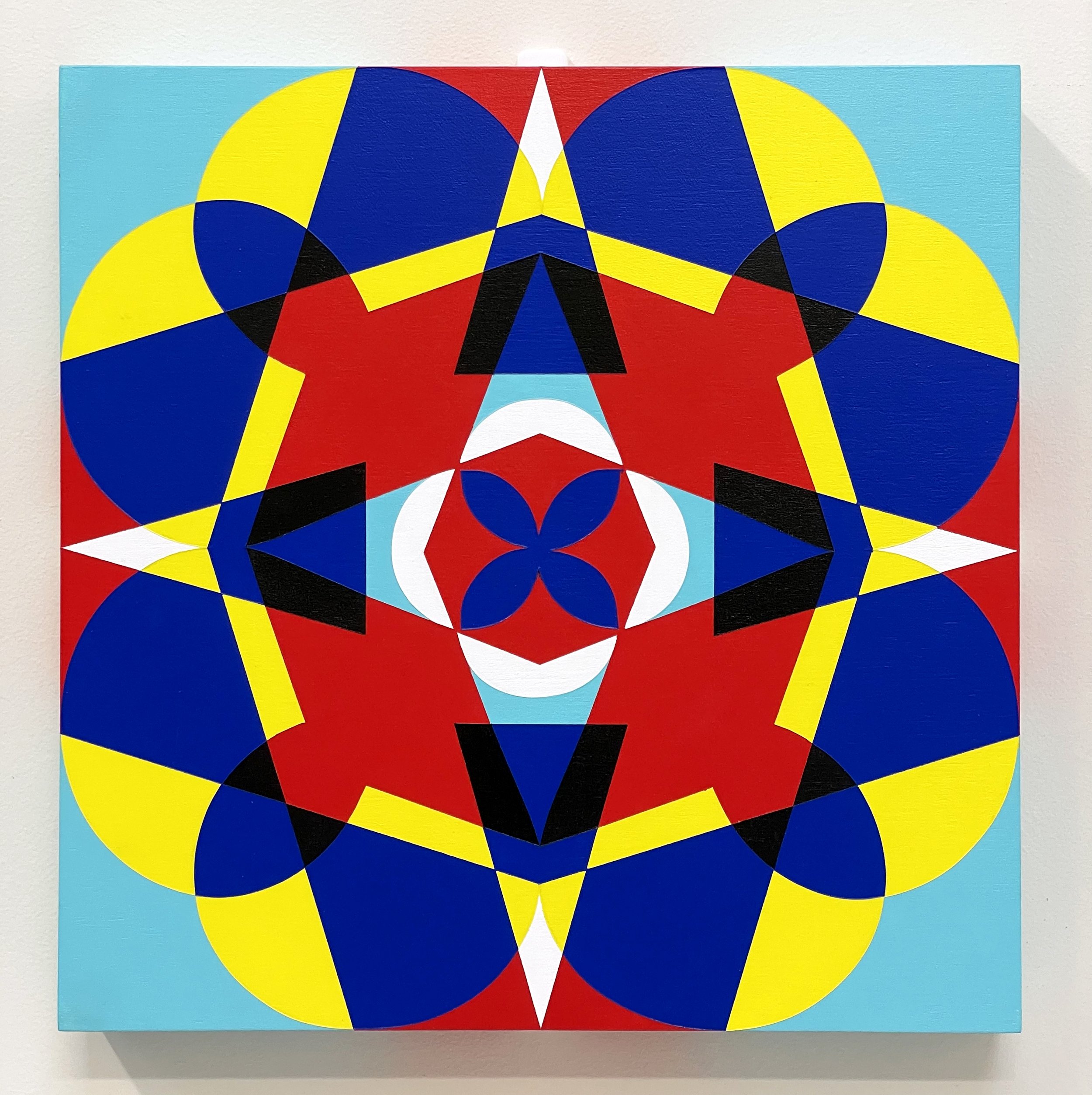
These paintings are a continuation of a series of artworks I’ve been working on since the start of the pandemic. They are designed using ‘bubble’ letters that I created, and spell out ‘7.6’ which is the current number [of millions] of Australians that were born overseas, many of whom have been separated from their home countries and families for almost two years due to Australia’s border closure policies.
The first panel says ‘7.6’ once, the second panel says it twice, and this third panel says it eight times. This symbolises the ideas of both repetition (Groundhog Day) and rapid manifestation, concepts which have been very prevalent in our society since the start of the pandemic. I have painted each triptych three times in different colour ways to emphasise these concepts.
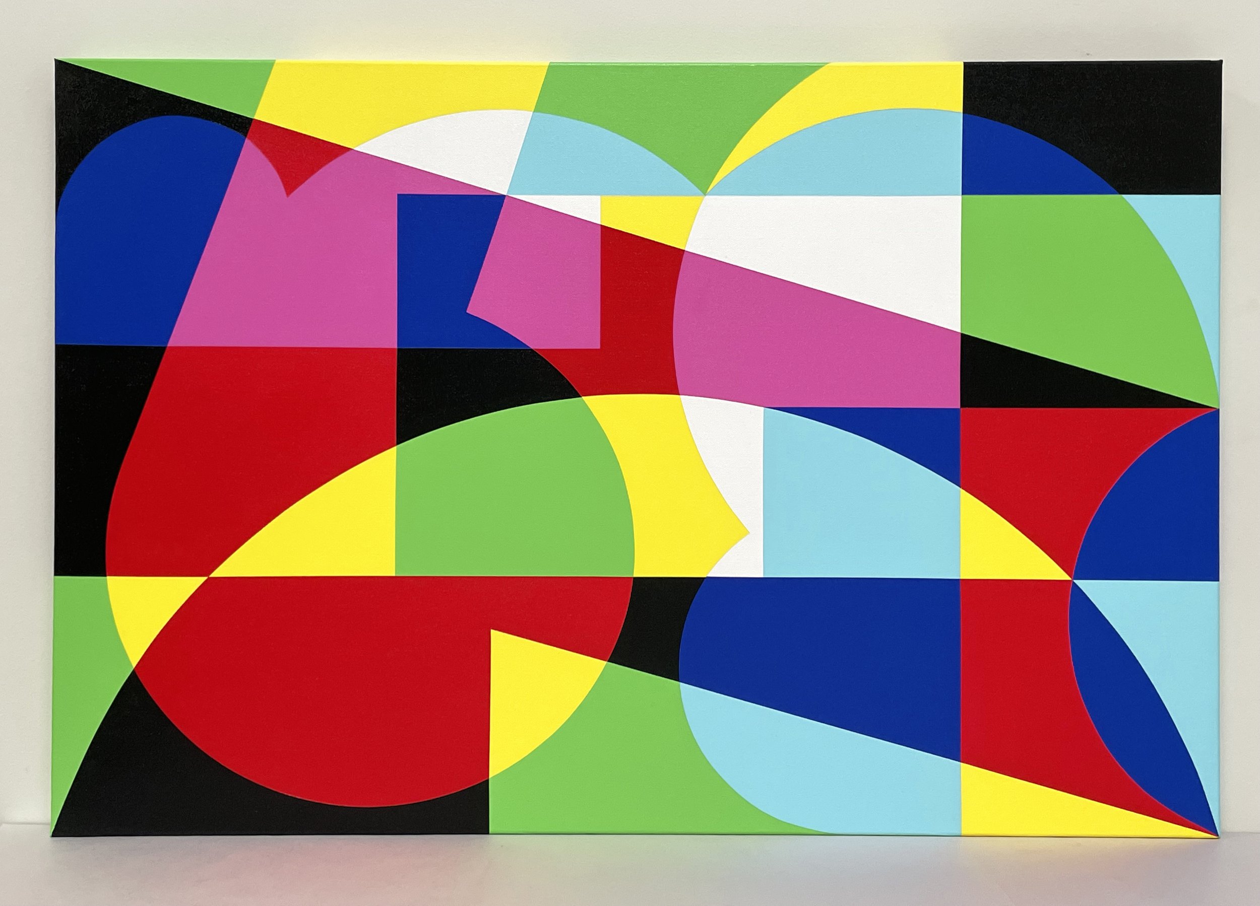
This painting is a continuation of a series of artworks I’ve been working on since the start of the pandemic. It is designed using ‘bubble’ letters that I created, which overlap each other and spell out ‘7.6 Million’ which is the current number of Australians that were born overseas, many of whom have been separated from their home countries and families for almost two years due to Australia’s border closure policies.
The colour palette references what happens when you separate white light into the three primary colours (red, green & blue) and overlap them to create the secondaries (cyan, magenta & yellow), and is an analogy for separation creating a rich spectrum of emotions. This piece is a homage to those who are suffering from separation grief, and hopefully offers a little bit of colourful comfort and hope.
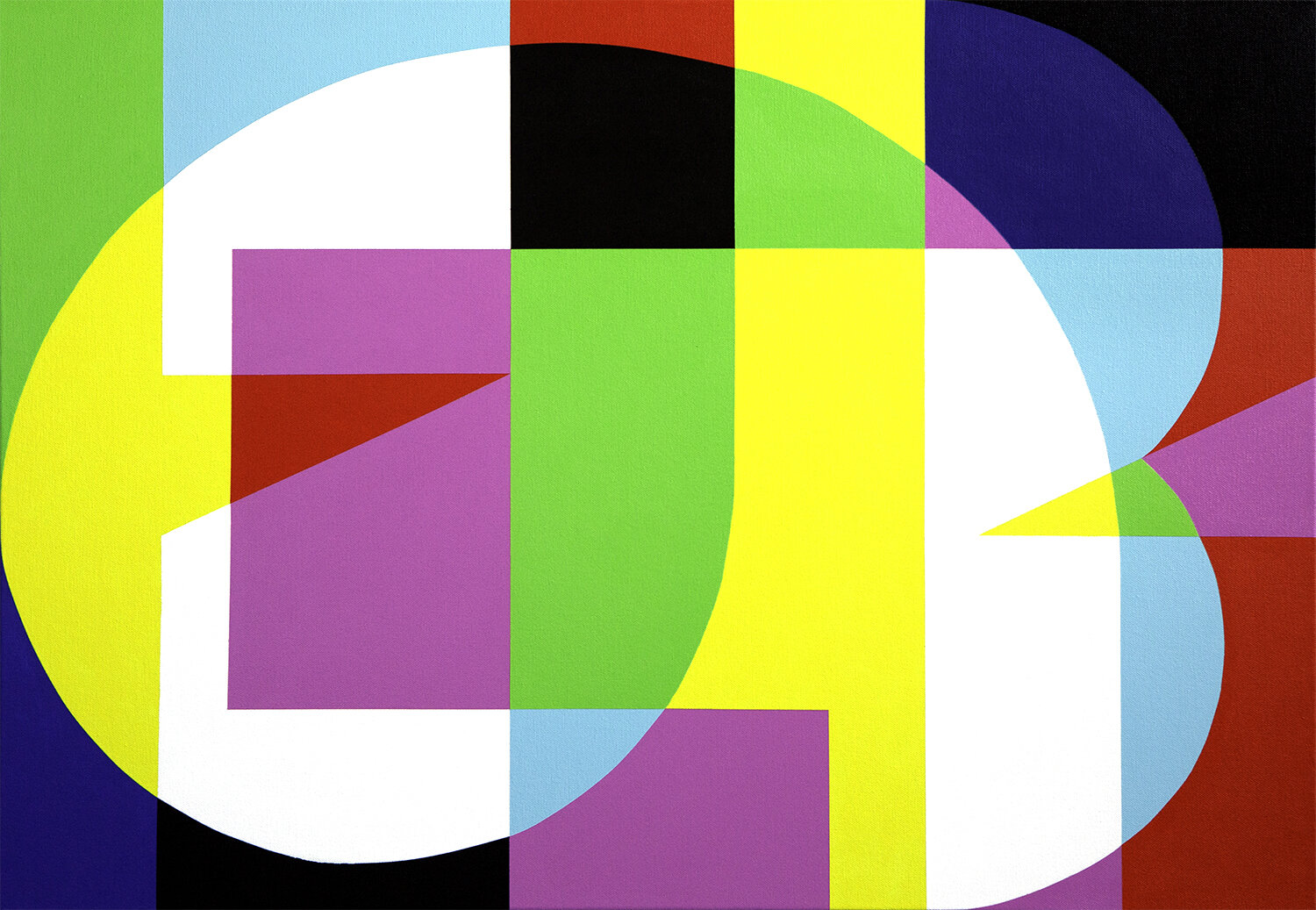
Using ‘bubble letters’ that I created, this piece spells the word ‘Dublin’, my hometown. It is part of a series of works that emerged as a direct response to the pandemic and the separation I felt between my family and my country.
The colour palette I use is limited to the primary and secondary colours which references what happens when you separate white light into the primaries (red, green & blue), and overlap them to create the secondaries (cyan, magenta & yellow), and is an analogy for separation and reconnection creating a rich spectrum of feelings and sentiments.
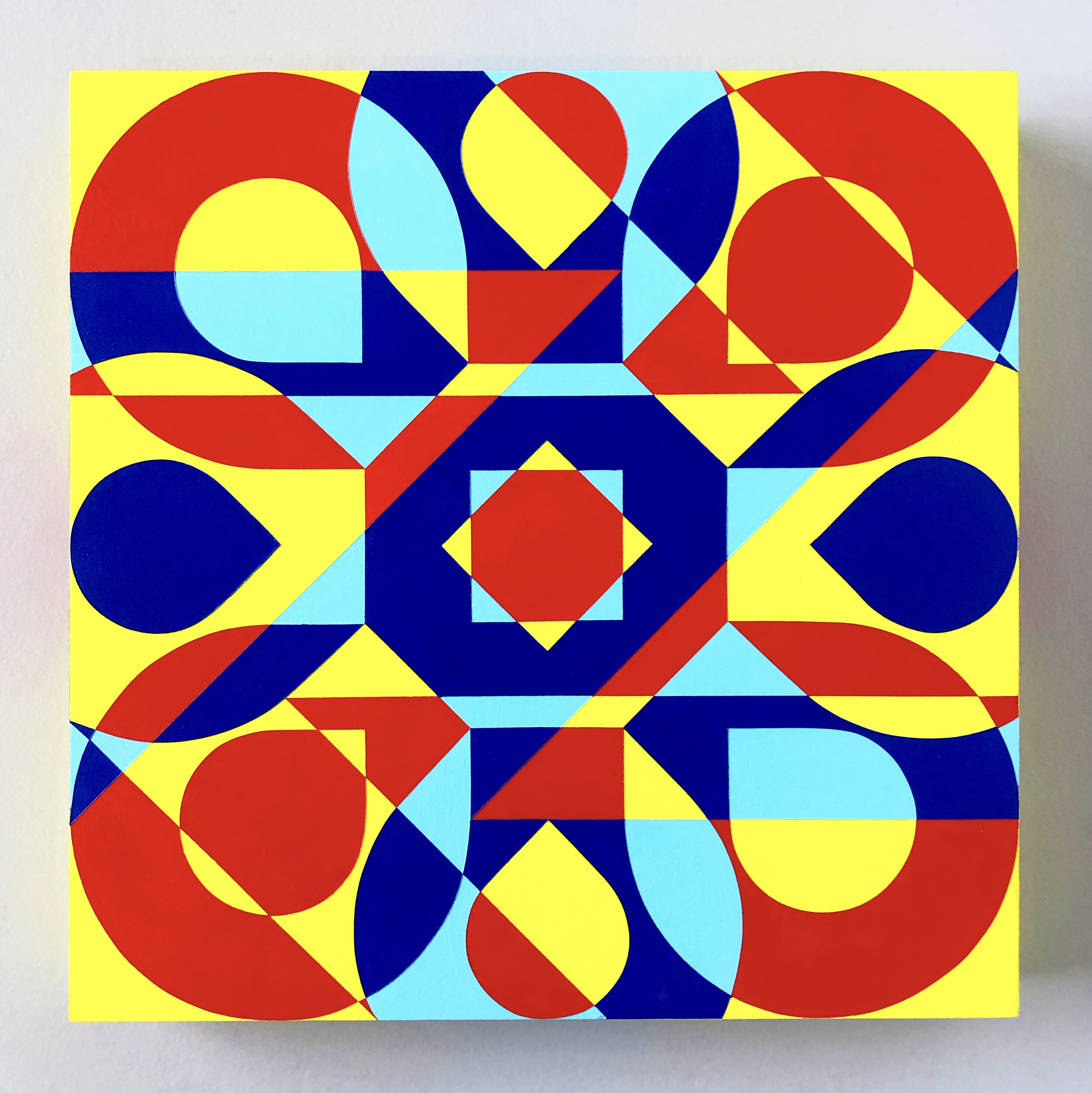
I think every graphic designer out there will relate to this one! ‘Undo’, for when you want to hit Command+Z on a situation (or if you’re old school like me, Apple+Z). Using my custom bubble letters.
I think every graphic designer out there will relate to this one! ‘Redo’, for when you want to undo the undo-ing and hit Command+Shift+Z on a situation (or if you’re old school like me, Apple+Shift+Z). Using my custom bubble letters.
Using ‘bubble letters’ that I created, this piece spells the names of my Mum, my Dad and my sister, who I’ve missed desperately since Australia closed its borders in March 2020. It is part of a series of works that emerged as a direct response to the pandemic and the separation I felt between my family and my country.
The colour palette I use is limited to the primary and secondary colours which references what happens when you separate white light into the primaries (red, green & blue), and overlap them to create the secondaries (cyan, magenta & yellow), and is an analogy for separation and reconnection creating a rich spectrum of feelings and sentiments.
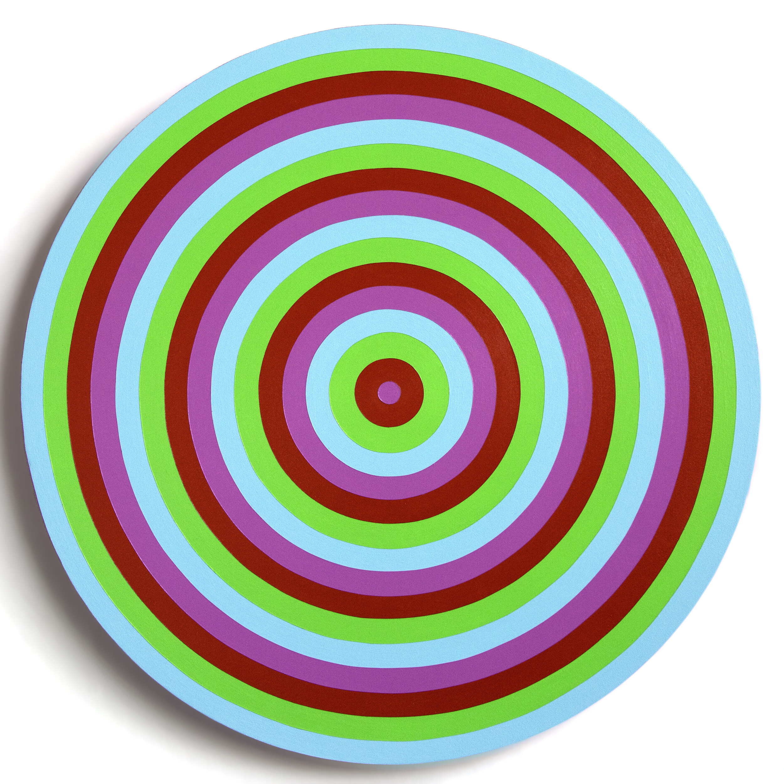
I painted this during our first mammoth lockdown in Melbourne in 2020. It felt never-ending, like we were all trapped in a vortex. It also references the idea of ‘bubbles’, remember when all of a sudden our measly social interactions had to exist in a bubble?!
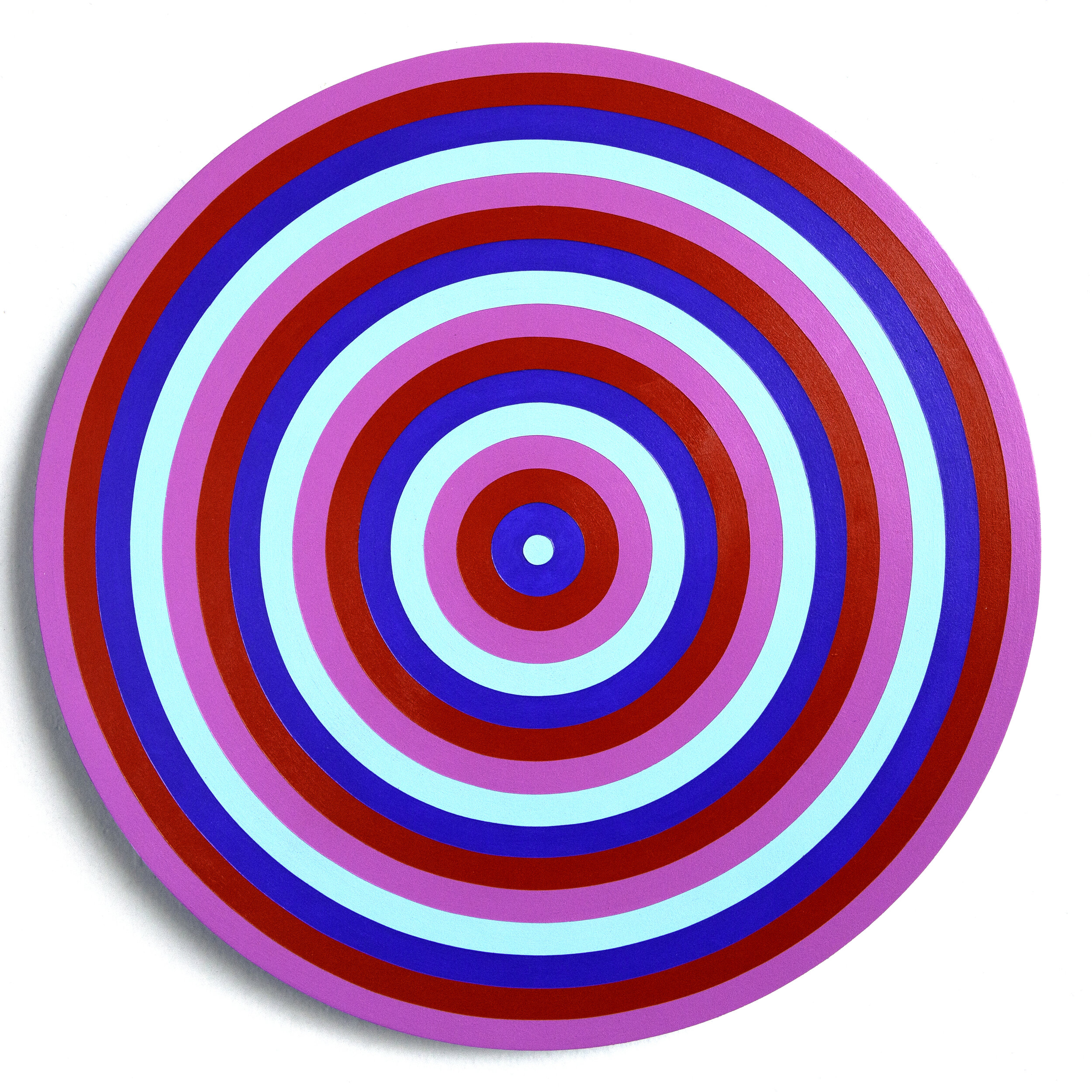
This was originally supposed to be ‘Lockdown Vortex 02’ to follow the previous painting ‘Lockdown Vortex’. However for some reason I put it aside and by the time I finished it, it happened to be the day in Melbourne at the end of that lengthy lockdown in 2020 when we had 16 days of ‘double doughnuts’! (For anyone not familiar with that term, it means zer🍩 covid cases and zer🍩 deaths). And could I believe my eyes when I realised this painting has 16 circles in it?! I couldn’t 😂
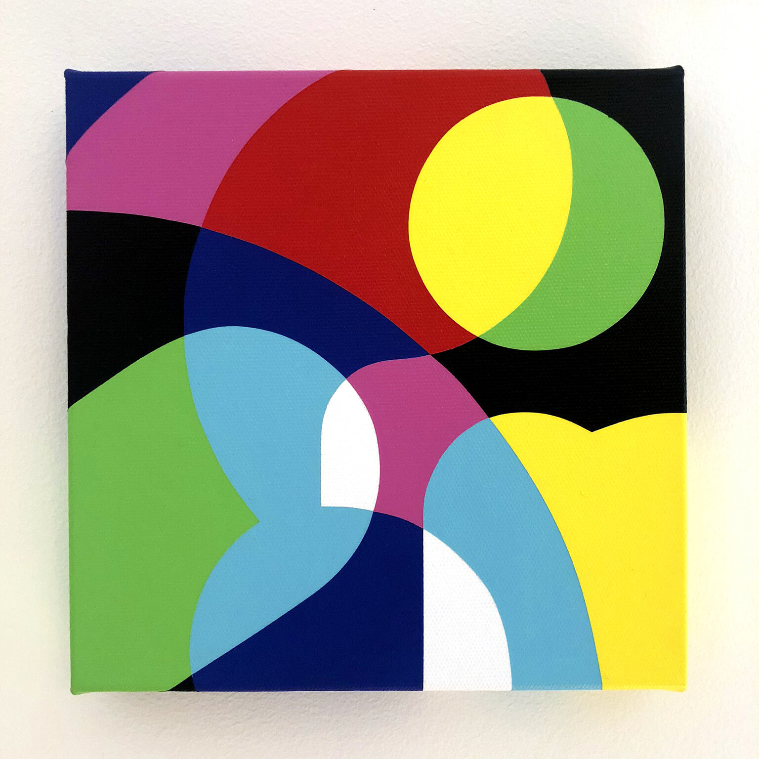
This is a simple little painting that says my sisters name. I am very close to my family and really struggled with the forced separation the pandemic caused. Painting my nearest and dearests names in bright colours helped ease the pain I felt being apart from them.
The colour palette I use is limited to the primary and secondary colours which references what happens when you separate white light into the primaries (red, green & blue), and overlap them to create the secondaries (cyan, magenta & yellow), and is an analogy for separation and reconnection creating a rich spectrum of feelings and sentiments.
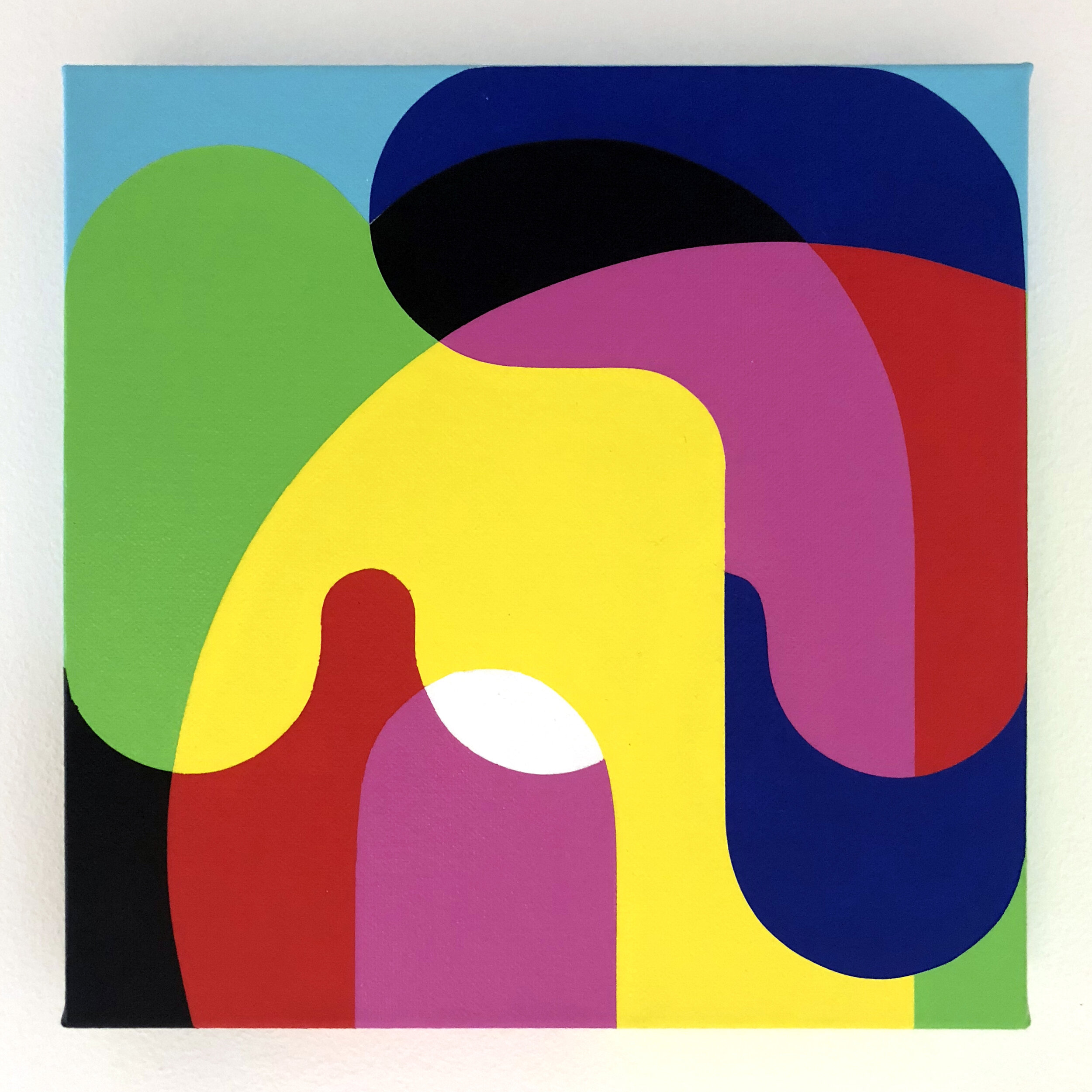
This is a simple little painting that says my nephews name. I am very close to my family and really struggled with the forced separation the pandemic caused. Painting my nearest and dearests names in bright colours helped ease the pain I felt being apart from them.
The colour palette I use is limited to the primary and secondary colours which references what happens when you separate white light into the primaries (red, green & blue), and overlap them to create the secondaries (cyan, magenta & yellow), and is an analogy for separation and reconnection creating a rich spectrum of feelings and sentiments.
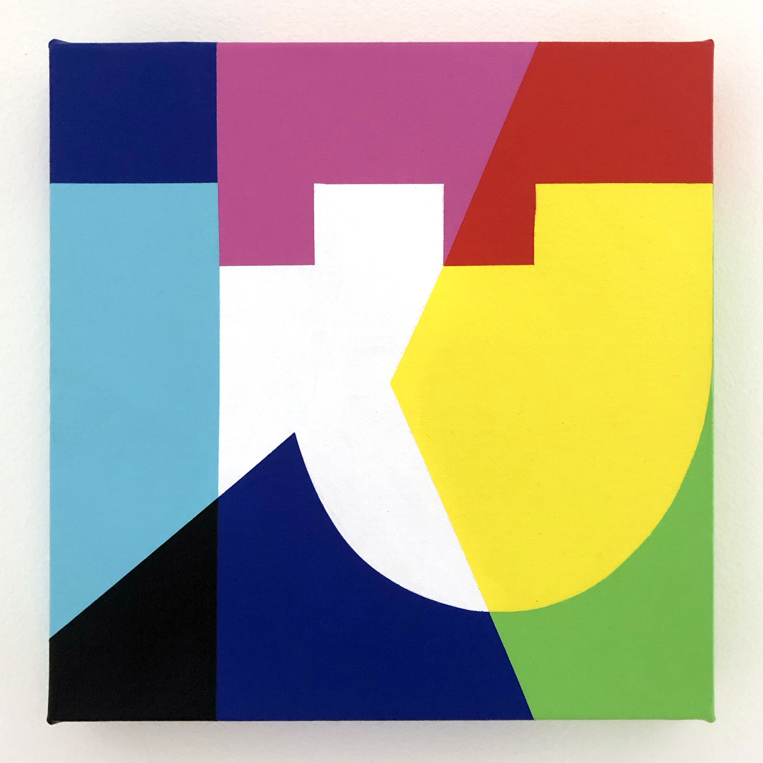
This is a simple little painting that says my brother-in-laws name. I am very close to my family and really struggled with the forced separation the pandemic caused. Painting my nearest and dearests names in bright colours helped ease the pain I felt being apart from them.
The colour palette I use is limited to the primary and secondary colours which references what happens when you separate white light into the primaries (red, green & blue), and overlap them to create the secondaries (cyan, magenta & yellow), and is an analogy for separation and reconnection creating a rich spectrum of feelings and sentiments. .
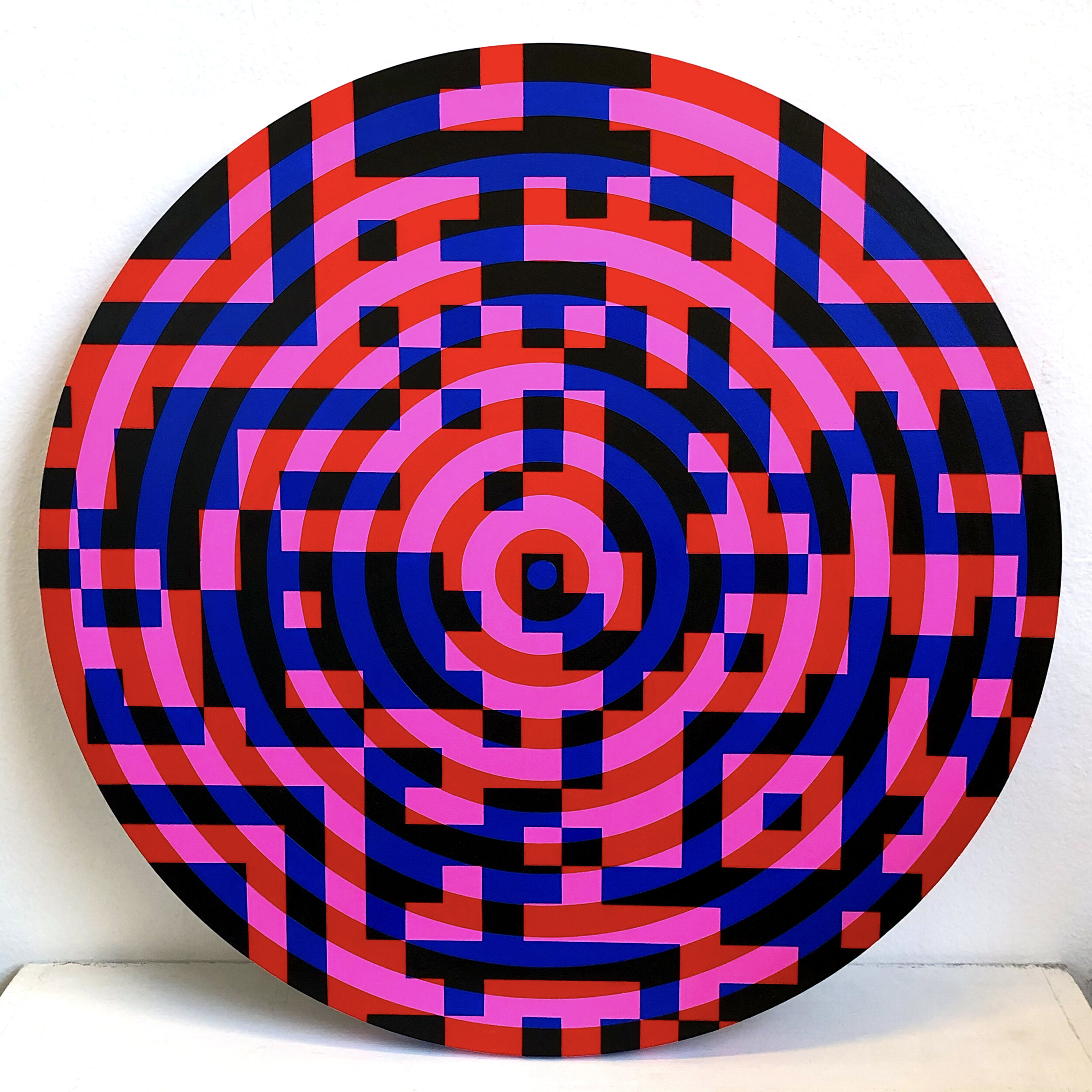
This was a ‘WTF is actually happening’ response to the start of 2021. I think at the end of 2020 we all thought things would be better and brighter in the New Year, and the hopes of a vaccine were on the near horizon. But it slowly dawned on us all that we were not even close to the end of the clusterf**k that is the COVID-19 pandemic. Checking in with QR codes was the new norm and here we still are…
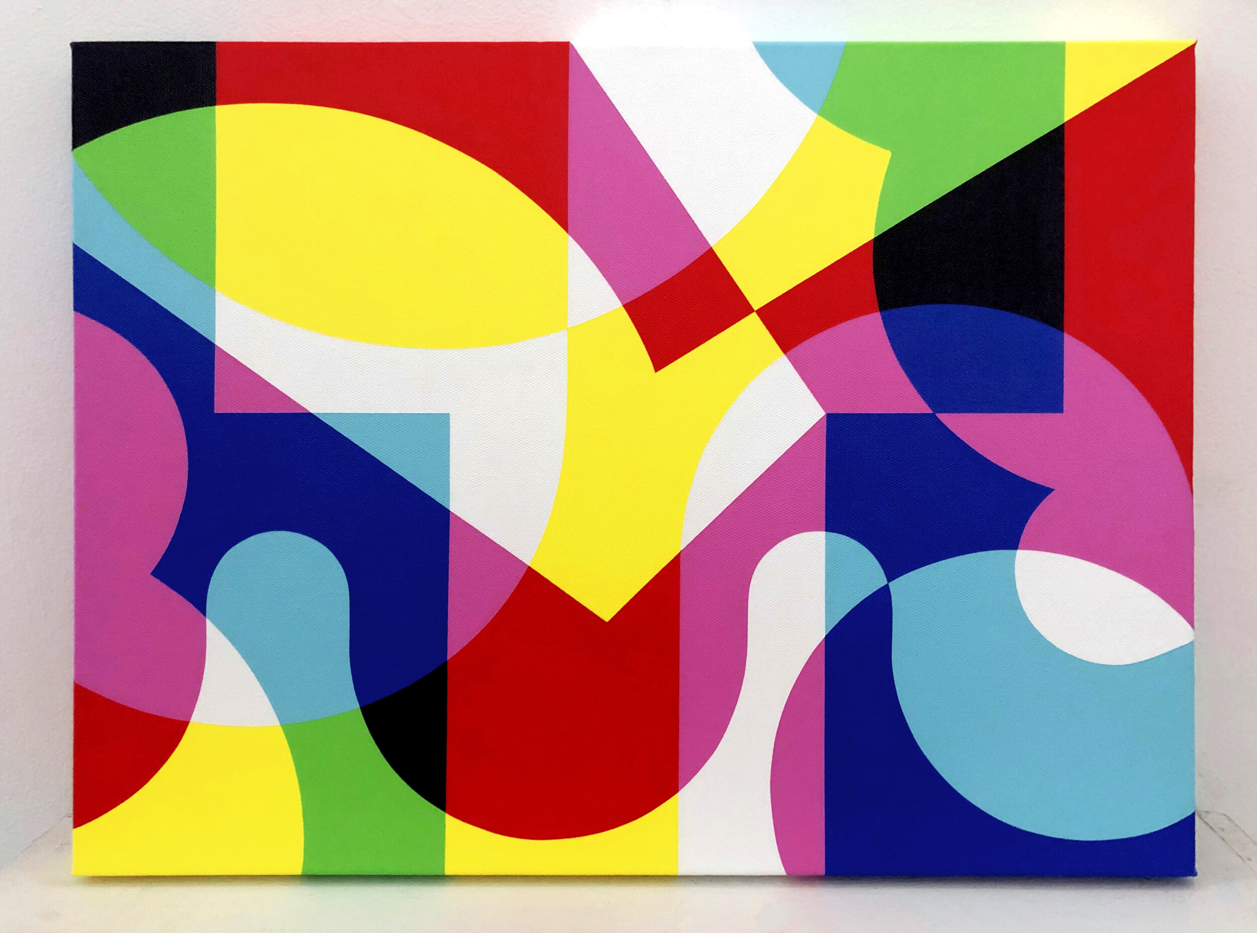
I probably don’t have to explain this one! I think I got so sick of saying this on Zoom calls I had to scream it loudly on a canvas! Another response to the COVID-19 pandemic.
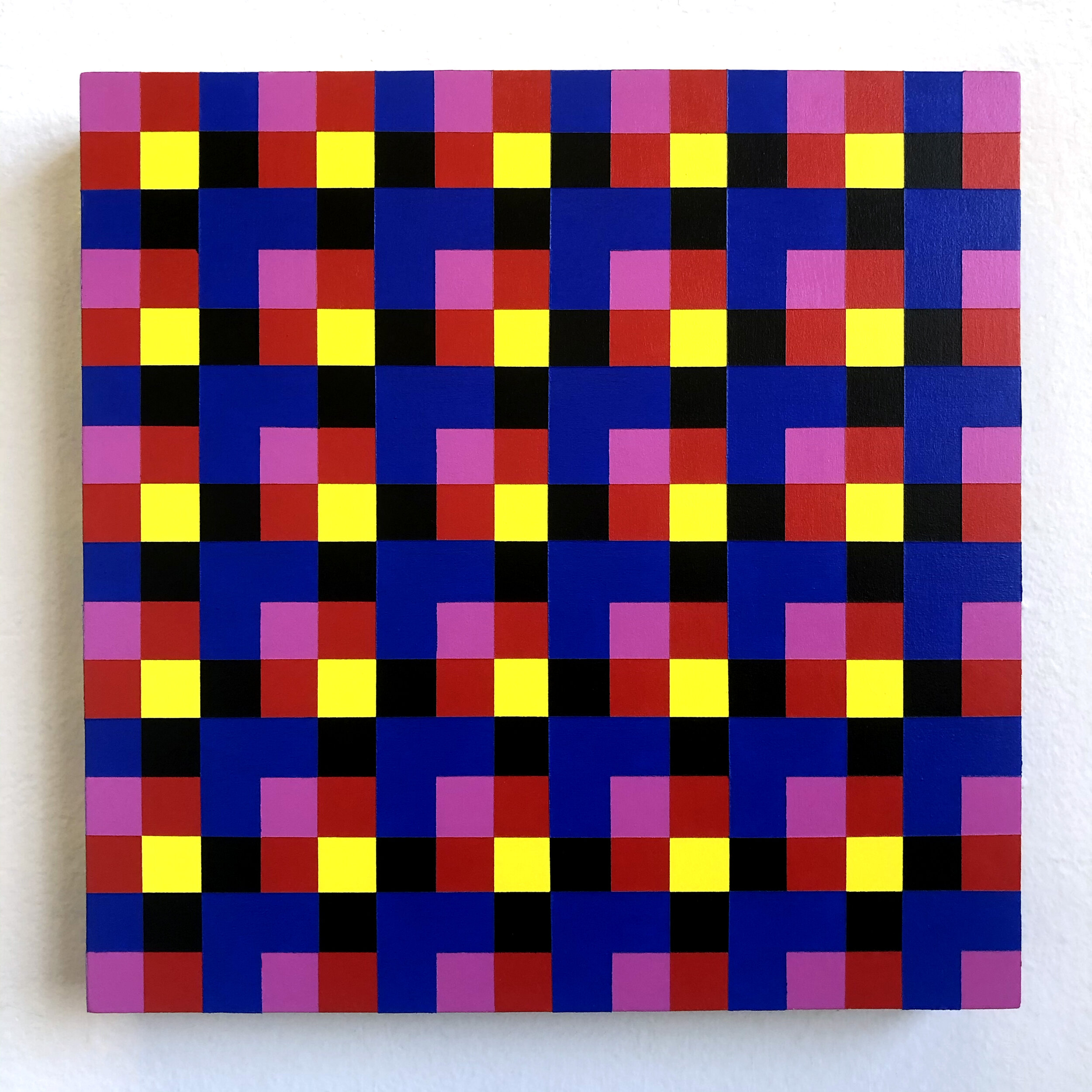
I’d just finished watching The Queens Gambit and got a bit obsessed with checkers! I’ve watched more on Netflix during lockdowns that I ever have, so I’m glad I can say I got something out of it and it wasn’t just pointless screen-time!
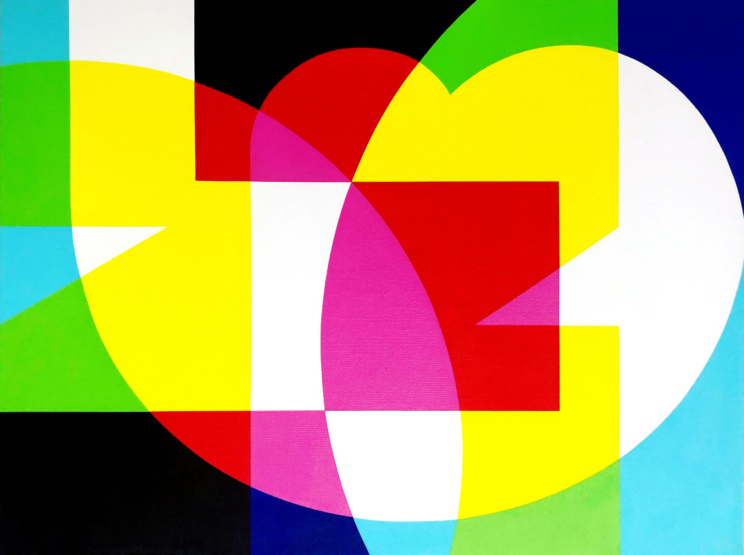
This was a gift for a dear friend, who like me is an expat living in Melbourne. Using ‘bubble letters’ that I created, this piece spells the word ‘London’, her hometown. As painting ‘Dublin’ helped comfort me from the separation I felt from my hometown during the pandemic, I hoped this painting would offer her the same comfort.
The colour palette I use is limited to the primary and secondary colours which references what happens when you separate white light into the primaries (red, green & blue), and overlap them to create the secondaries (cyan, magenta & yellow), and is an analogy for separation and reconnection creating a rich spectrum of feelings and sentiments.
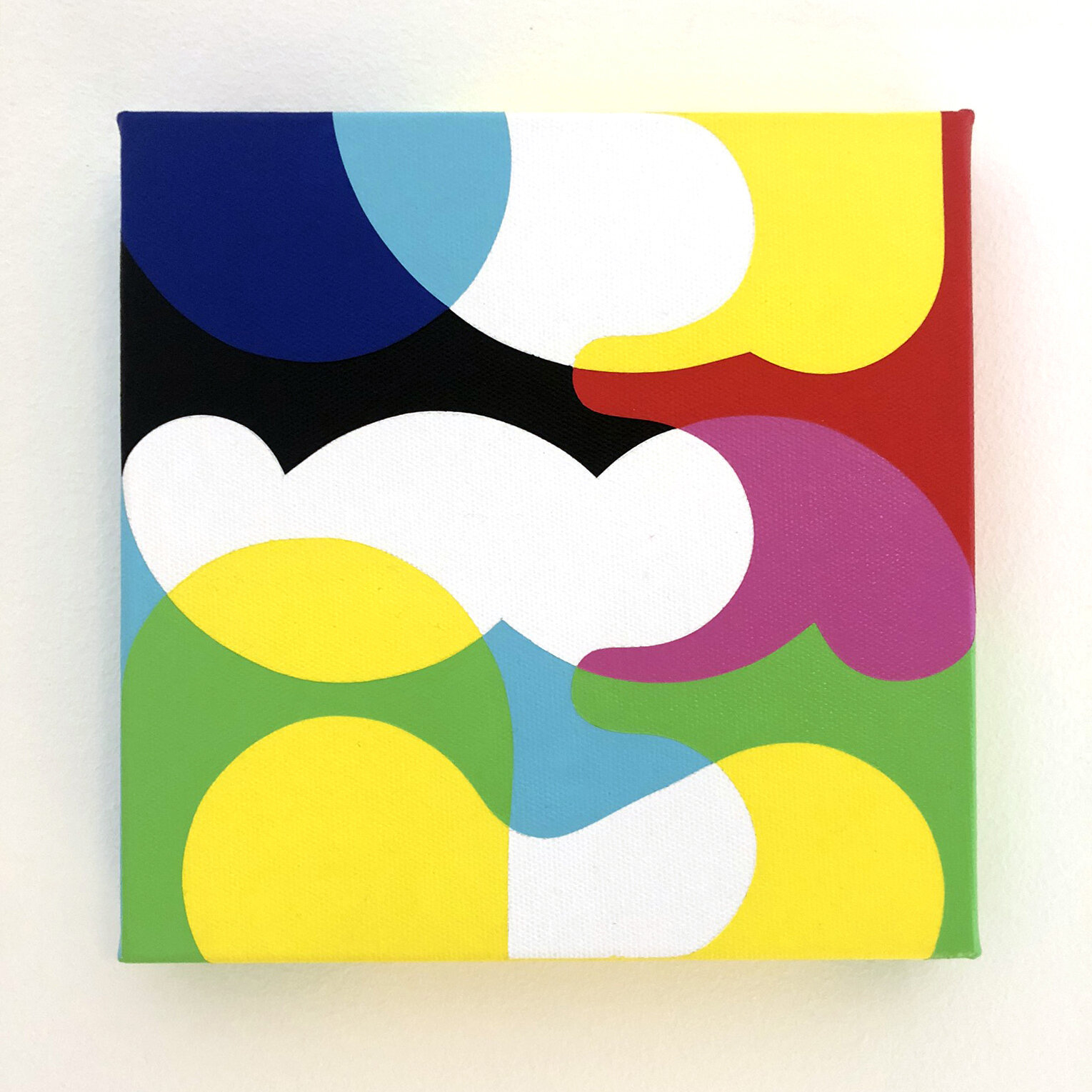
This is a simple little painting that says my Mums nickname. I am very close to my family and really struggled with the forced separation the pandemic caused. Painting my nearest and dearests names in bright colours helped ease the pain I felt being apart from them.
The colour palette I use is limited to the primary and secondary colours which references what happens when you separate white light into the primaries (red, green & blue), and overlap them to create the secondaries (cyan, magenta & yellow), and is an analogy for separation and reconnection creating a rich spectrum of feelings and sentiments.
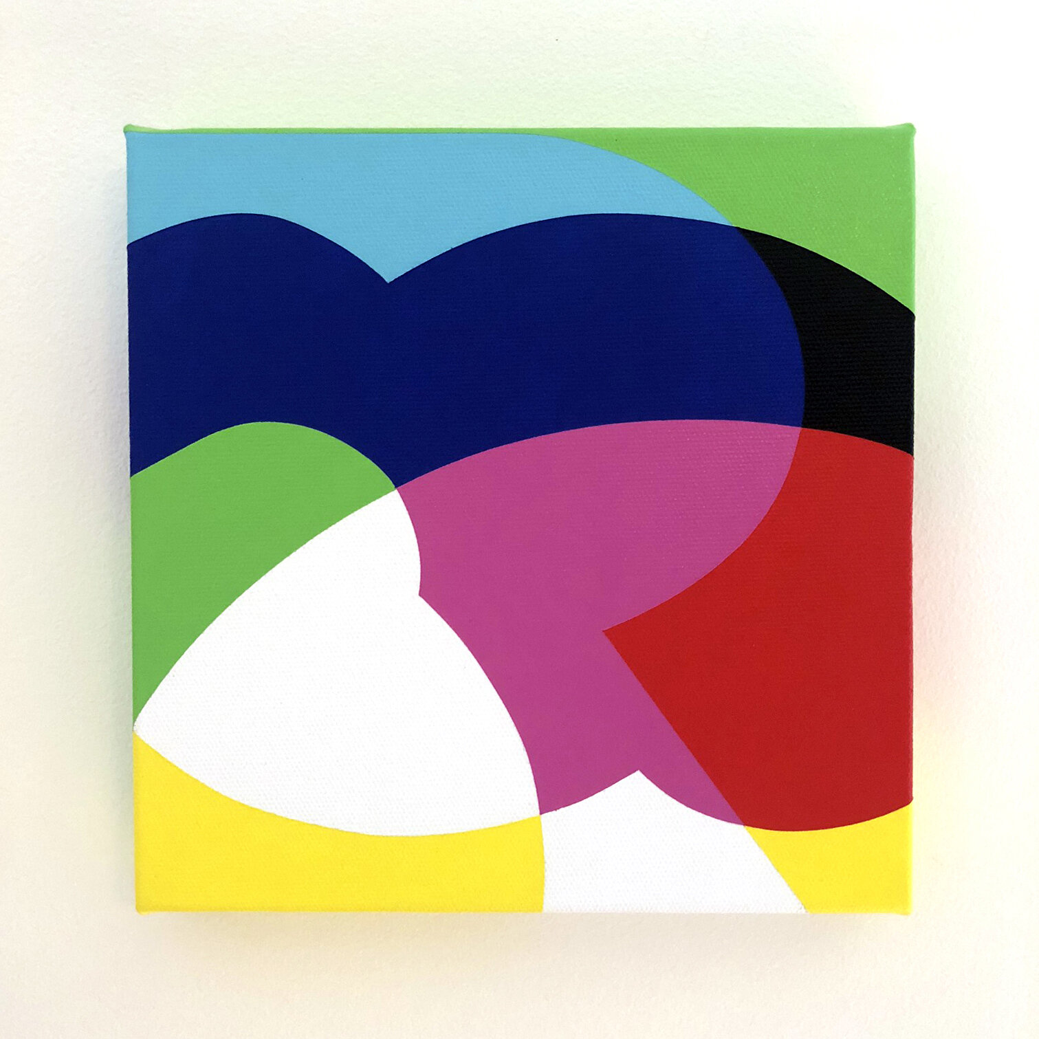
This is a simple little painting that says my Dads name. I am very close to my family and really struggled with the forced separation the pandemic caused. Painting my nearest and dearests names in bright colours helped ease the pain I felt being apart from them.
The colour palette I use is limited to the primary and secondary colours which references what happens when you separate white light into the primaries (red, green & blue), and overlap them to create the secondaries (cyan, magenta & yellow), and is an analogy for separation and reconnection creating a rich spectrum of feelings and sentiments.
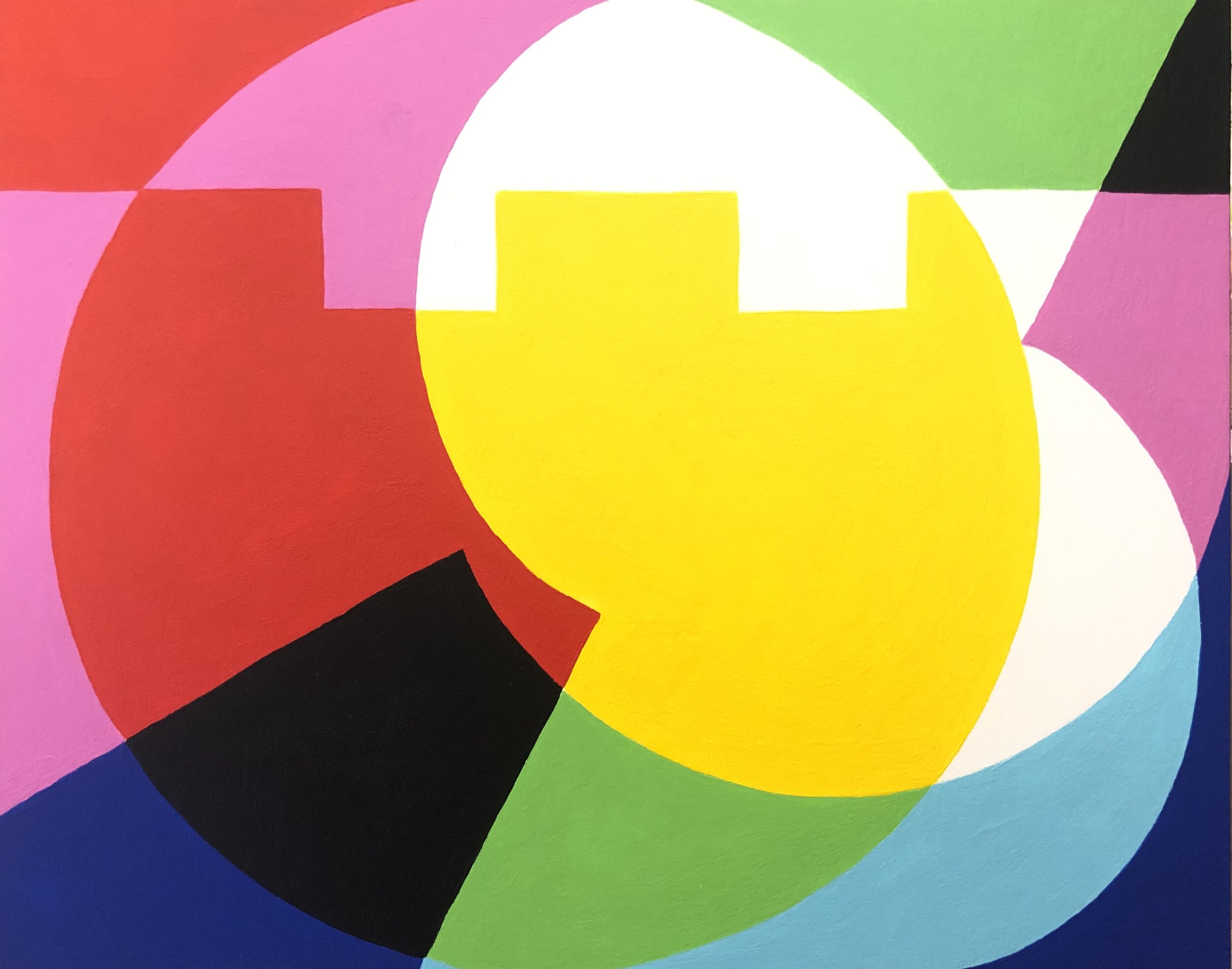
You could almost say this is where it all began! I did an art-swap my my dear friend Rose, and the painting she gave me metaphorically had my name on it. This painting I did for Rose literally has her name on it! This was the first time I used my bubble letters, and I knew I was on to something I wanted to run with.
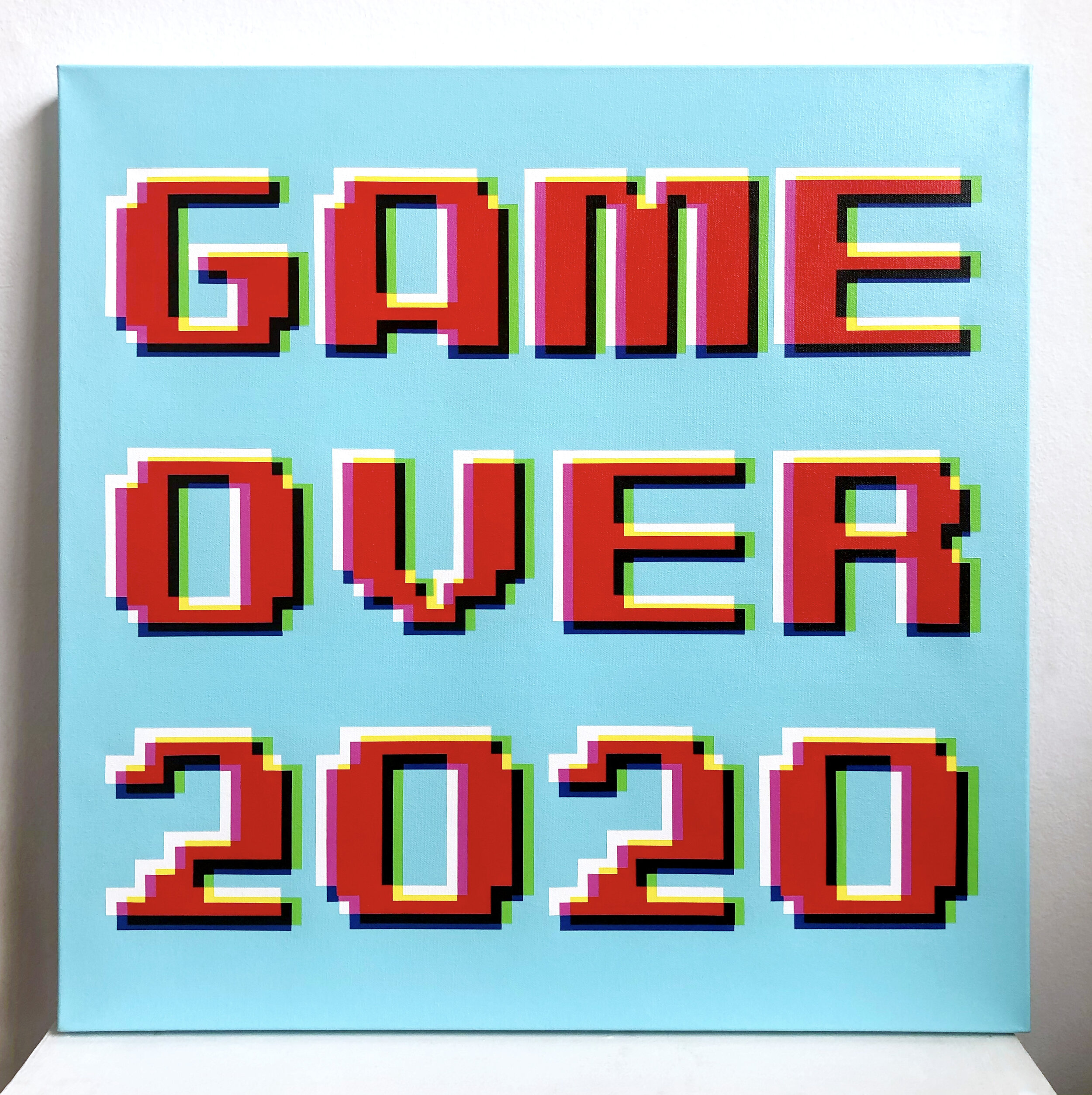
At the end of 2020 I was feeling like we had finally reached the end of the worst possible year and I had to paint a response to that feeling. It’s supposed to reference the 8-bit video screen from the 80s or 90s. How cocky was I to think that 2021 would be any better?! Maybe I need to paint a picture at the end of this year that says ‘IN MY FACE 2021’…


This painting is the last in a series I call The Sum Of Its Parts. This series explores the concepts of overwhelm and awe, and aims to invoke these feelings through strong geometric designs, and either clashing or complimentary colour choices.
This painting is fifth in a series I call The Sum Of Its Parts. This series explores the concepts of overwhelm and awe, and aims to invoke these feelings through strong geometric designs, and either clashing or complimentary colour choices.
This painting is fourth in a series I call The Sum Of Its Parts. This series explores the concepts of overwhelm and awe, and aims to invoke these feelings through strong geometric designs, and either clashing or complimentary colour choices.
This painting is third in a series I call The Sum Of Its Parts. This series explores the concepts of overwhelm and awe, and aims to invoke these feelings through strong geometric designs, and either clashing or complimentary colour choices.
This painting is second in a series I call The Sum Of Its Parts. This series explores the concepts of overwhelm and awe, and aims to invoke these feelings through strong geometric designs, and either clashing or complimentary colour choices.
This painting is the first in a series I call The Sum Of Its Parts. This series explores the concepts of overwhelm and awe, and aims to invoke these feelings through strong geometric designs, and either clashing or complimentary colour choices. This painting is also the largest of all my works to date, and as I’m a glutton for punishment, was completed freehand.
‘Open’ has been one of those buzz words of the last 6 months, so I thought it was appropriate to start the year off with painting that celebrates the long awaited opening of Australia’s border later this month. It references the Apple keyboard shortcut Command+O for ‘Open’.
‘Open’ has been one of those buzz words of the last 6 months, so I thought it was appropriate to start the year off with painting that celebrates the long awaited opening of Australia’s border later this month. It references the Apple keyboard shortcut Command+O for ‘Open’.
‘Open’ has been one of those buzz words of the last 6 months, so I thought it was appropriate to start the year off with painting that celebrates the long awaited opening of Australia’s border later this month. It references the Apple keyboard shortcut Command+O for ‘Open’.
‘Open’ has been one of those buzz words of the last 6 months, so I thought it was appropriate to start the year off with painting that celebrates the long awaited opening of Australia’s border later this month. It references the Apple keyboard shortcut Command+O for ‘Open’
To celebrate International Women’s Day 2022, and all the amazing women in my life and beyond, I painted ‘Sisterhood 02’ based on the symbol for ‘woman’.
“A clutch of women is the most tender, most tough place on Earth” — Where The Crawdads Sing, by Delia Owens
To celebrate International Women’s Day 2022, and all the amazing women in my life and beyond, I painted ‘Sisterhood 01’ based on the symbol for ‘woman’.
“A clutch of women is the most tender, most tough place on Earth” — Where The Crawdads Sing, by Delia Owens
This was a commission for a family in Stockholm, Sweden. The lettering spells the initials of each family member.
My Mum often says that ‘time is elastic’, and this has never felt more apt than the last 18 months. During the dark days of lockdown, time puckered in to pass at an agonising glacial pace. When we were free, time puffed out like a helium balloon and floated to the ceiling before we could catch the string.
These three little paintings explore the idea of time being stretchy, and they took a crazy amount of time — approximately 40 hours each! But when I started them it turned out that time went all helium on me, and I was so involved in them that it sped up this bloody long lockdown exponentially! Time is precious, Time is exact, Time is relative, Time is the fourth dimension, Time is elastic. Thanks Time for being so HARDCORE! 👊
These paintings are a continuation of a series of artworks I’ve been working on since the start of the pandemic. They are designed using ‘bubble’ letters that I created, and spell out ‘7.6’ which is the current number [of millions] of Australians that were born overseas, many of whom have been separated from their home countries and families for almost two years due to Australia’s border closure policies.
This first panel says ‘7.6’ once, the second panel says it twice, and the third panel says it eight times. This symbolises the ideas of both repetition (Groundhog Day) and rapid manifestation, concepts which have been very prevalent in our society since the start of the pandemic. I have painted each triptych three times in different colour ways to emphasise these concepts.
These paintings are a continuation of a series of artworks I’ve been working on since the start of the pandemic. They are designed using ‘bubble’ letters that I created, and spell out ‘7.6’ which is the current number [of millions] of Australians that were born overseas, many of whom have been separated from their home countries and families for almost two years due to Australia’s border closure policies.
The first panel says ‘7.6’ once, this second panel says it twice, and the third panel says it eight times. This symbolises the ideas of both repetition (Groundhog Day) and rapid manifestation, concepts which have been very prevalent in our society since the start of the pandemic. I have painted each triptych three times in different colour ways to emphasise these concepts.
These paintings are a continuation of a series of artworks I’ve been working on since the start of the pandemic. They are designed using ‘bubble’ letters that I created, and spell out ‘7.6’ which is the current number [of millions] of Australians that were born overseas, many of whom have been separated from their home countries and families for almost two years due to Australia’s border closure policies.
The first panel says ‘7.6’ once, the second panel says it twice, and this third panel says it eight times. This symbolises the ideas of both repetition (Groundhog Day) and rapid manifestation, concepts which have been very prevalent in our society since the start of the pandemic. I have painted each triptych three times in different colour ways to emphasise these concepts.
These paintings are a continuation of a series of artworks I’ve been working on since the start of the pandemic. They are designed using ‘bubble’ letters that I created, and spell out ‘7.6’ which is the current number [of millions] of Australians that were born overseas, many of whom have been separated from their home countries and families for almost two years due to Australia’s border closure policies.
This first panel says ‘7.6’ once, the second panel says it twice, and the third panel says it eight times. This symbolises the ideas of both repetition (Groundhog Day) and rapid manifestation, concepts which have been very prevalent in our society since the start of the pandemic. I have painted each triptych three times in different colour ways to emphasise these concepts.
These paintings are a continuation of a series of artworks I’ve been working on since the start of the pandemic. They are designed using ‘bubble’ letters that I created, and spell out ‘7.6’ which is the current number [of millions] of Australians that were born overseas, many of whom have been separated from their home countries and families for almost two years due to Australia’s border closure policies.
The first panel says ‘7.6’ once, this second panel says it twice, and the third panel says it eight times. This symbolises the ideas of both repetition (Groundhog Day) and rapid manifestation, concepts which have been very prevalent in our society since the start of the pandemic. I have painted each triptych three times in different colour ways to emphasise these concepts.
These paintings are a continuation of a series of artworks I’ve been working on since the start of the pandemic. They are designed using ‘bubble’ letters that I created, and spell out ‘7.6’ which is the current number [of millions] of Australians that were born overseas, many of whom have been separated from their home countries and families for almost two years due to Australia’s border closure policies.
The first panel says ‘7.6’ once, the second panel says it twice, and this third panel says it eight times. This symbolises the ideas of both repetition (Groundhog Day) and rapid manifestation, concepts which have been very prevalent in our society since the start of the pandemic. I have painted each triptych three times in different colour ways to emphasise these concepts.
This painting is a continuation of a series of artworks I’ve been working on since the start of the pandemic. It is designed using ‘bubble’ letters that I created, which overlap each other and spell out ‘7.6 Million’ which is the current number of Australians that were born overseas, many of whom have been separated from their home countries and families for almost two years due to Australia’s border closure policies.
The colour palette references what happens when you separate white light into the three primary colours (red, green & blue) and overlap them to create the secondaries (cyan, magenta & yellow), and is an analogy for separation creating a rich spectrum of emotions. This piece is a homage to those who are suffering from separation grief, and hopefully offers a little bit of colourful comfort and hope.
Using ‘bubble letters’ that I created, this piece spells the word ‘Dublin’, my hometown. It is part of a series of works that emerged as a direct response to the pandemic and the separation I felt between my family and my country.
The colour palette I use is limited to the primary and secondary colours which references what happens when you separate white light into the primaries (red, green & blue), and overlap them to create the secondaries (cyan, magenta & yellow), and is an analogy for separation and reconnection creating a rich spectrum of feelings and sentiments.
I think every graphic designer out there will relate to this one! ‘Undo’, for when you want to hit Command+Z on a situation (or if you’re old school like me, Apple+Z). Using my custom bubble letters.
I think every graphic designer out there will relate to this one! ‘Redo’, for when you want to undo the undo-ing and hit Command+Shift+Z on a situation (or if you’re old school like me, Apple+Shift+Z). Using my custom bubble letters.
Using ‘bubble letters’ that I created, this piece spells the names of my Mum, my Dad and my sister, who I’ve missed desperately since Australia closed its borders in March 2020. It is part of a series of works that emerged as a direct response to the pandemic and the separation I felt between my family and my country.
The colour palette I use is limited to the primary and secondary colours which references what happens when you separate white light into the primaries (red, green & blue), and overlap them to create the secondaries (cyan, magenta & yellow), and is an analogy for separation and reconnection creating a rich spectrum of feelings and sentiments.
I painted this during our first mammoth lockdown in Melbourne in 2020. It felt never-ending, like we were all trapped in a vortex. It also references the idea of ‘bubbles’, remember when all of a sudden our measly social interactions had to exist in a bubble?!
This was originally supposed to be ‘Lockdown Vortex 02’ to follow the previous painting ‘Lockdown Vortex’. However for some reason I put it aside and by the time I finished it, it happened to be the day in Melbourne at the end of that lengthy lockdown in 2020 when we had 16 days of ‘double doughnuts’! (For anyone not familiar with that term, it means zer🍩 covid cases and zer🍩 deaths). And could I believe my eyes when I realised this painting has 16 circles in it?! I couldn’t 😂
This is a simple little painting that says my sisters name. I am very close to my family and really struggled with the forced separation the pandemic caused. Painting my nearest and dearests names in bright colours helped ease the pain I felt being apart from them.
The colour palette I use is limited to the primary and secondary colours which references what happens when you separate white light into the primaries (red, green & blue), and overlap them to create the secondaries (cyan, magenta & yellow), and is an analogy for separation and reconnection creating a rich spectrum of feelings and sentiments.
This is a simple little painting that says my nephews name. I am very close to my family and really struggled with the forced separation the pandemic caused. Painting my nearest and dearests names in bright colours helped ease the pain I felt being apart from them.
The colour palette I use is limited to the primary and secondary colours which references what happens when you separate white light into the primaries (red, green & blue), and overlap them to create the secondaries (cyan, magenta & yellow), and is an analogy for separation and reconnection creating a rich spectrum of feelings and sentiments.
This is a simple little painting that says my brother-in-laws name. I am very close to my family and really struggled with the forced separation the pandemic caused. Painting my nearest and dearests names in bright colours helped ease the pain I felt being apart from them.
The colour palette I use is limited to the primary and secondary colours which references what happens when you separate white light into the primaries (red, green & blue), and overlap them to create the secondaries (cyan, magenta & yellow), and is an analogy for separation and reconnection creating a rich spectrum of feelings and sentiments. .
This was a ‘WTF is actually happening’ response to the start of 2021. I think at the end of 2020 we all thought things would be better and brighter in the New Year, and the hopes of a vaccine were on the near horizon. But it slowly dawned on us all that we were not even close to the end of the clusterf**k that is the COVID-19 pandemic. Checking in with QR codes was the new norm and here we still are…
I probably don’t have to explain this one! I think I got so sick of saying this on Zoom calls I had to scream it loudly on a canvas! Another response to the COVID-19 pandemic.
I’d just finished watching The Queens Gambit and got a bit obsessed with checkers! I’ve watched more on Netflix during lockdowns that I ever have, so I’m glad I can say I got something out of it and it wasn’t just pointless screen-time!
This was a gift for a dear friend, who like me is an expat living in Melbourne. Using ‘bubble letters’ that I created, this piece spells the word ‘London’, her hometown. As painting ‘Dublin’ helped comfort me from the separation I felt from my hometown during the pandemic, I hoped this painting would offer her the same comfort.
The colour palette I use is limited to the primary and secondary colours which references what happens when you separate white light into the primaries (red, green & blue), and overlap them to create the secondaries (cyan, magenta & yellow), and is an analogy for separation and reconnection creating a rich spectrum of feelings and sentiments.
This is a simple little painting that says my Mums nickname. I am very close to my family and really struggled with the forced separation the pandemic caused. Painting my nearest and dearests names in bright colours helped ease the pain I felt being apart from them.
The colour palette I use is limited to the primary and secondary colours which references what happens when you separate white light into the primaries (red, green & blue), and overlap them to create the secondaries (cyan, magenta & yellow), and is an analogy for separation and reconnection creating a rich spectrum of feelings and sentiments.
This is a simple little painting that says my Dads name. I am very close to my family and really struggled with the forced separation the pandemic caused. Painting my nearest and dearests names in bright colours helped ease the pain I felt being apart from them.
The colour palette I use is limited to the primary and secondary colours which references what happens when you separate white light into the primaries (red, green & blue), and overlap them to create the secondaries (cyan, magenta & yellow), and is an analogy for separation and reconnection creating a rich spectrum of feelings and sentiments.
You could almost say this is where it all began! I did an art-swap my my dear friend Rose, and the painting she gave me metaphorically had my name on it. This painting I did for Rose literally has her name on it! This was the first time I used my bubble letters, and I knew I was on to something I wanted to run with.
At the end of 2020 I was feeling like we had finally reached the end of the worst possible year and I had to paint a response to that feeling. It’s supposed to reference the 8-bit video screen from the 80s or 90s. How cocky was I to think that 2021 would be any better?! Maybe I need to paint a picture at the end of this year that says ‘IN MY FACE 2021’…
